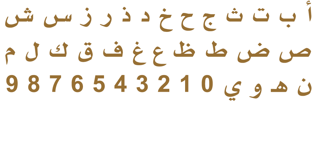
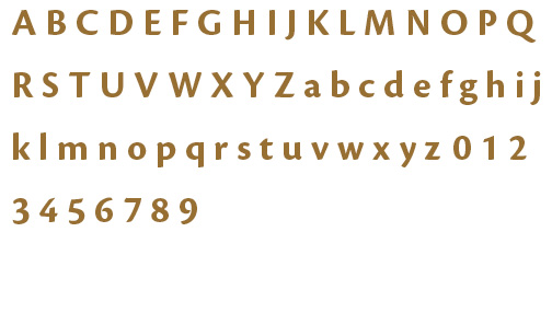
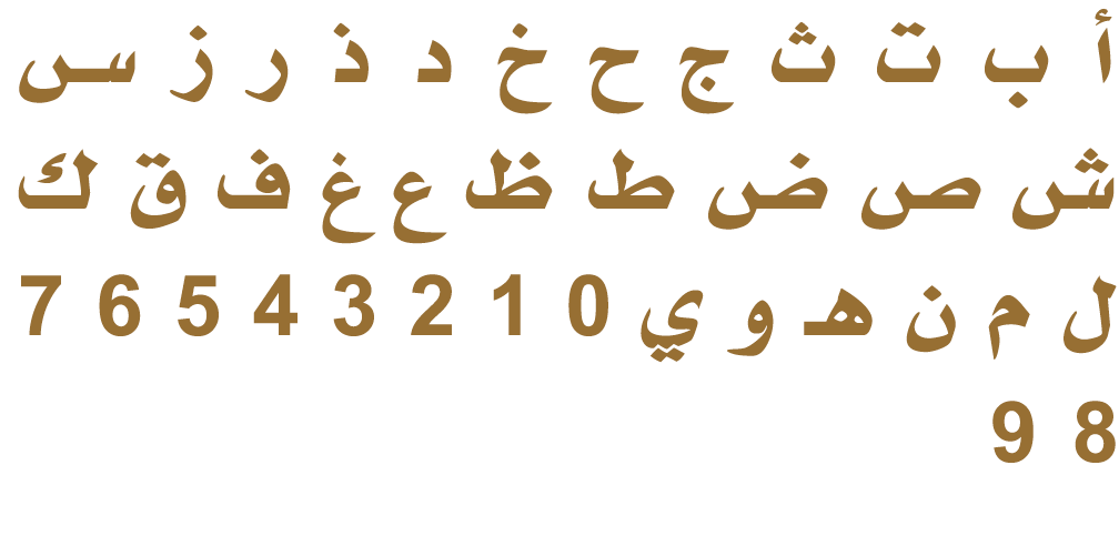
Visual Identity Guidelines

Minister of State Office

Logo

Logo Anatomy

Primary Logo Construction

The winged logo—with the Arabic and English wordmarks on either side of the emblem—is the preferred composition.

  • Emblem in the centre; Arabic wordmark to the right; English wordmark to the left.
  • Country name on the first line of the wordmark; ministry name on the second line.
  • Arabic wordmark set in the AXT Manal typeface and left aligned.
  • English wordmark set in the Cronos Pro typeface in all caps and right aligned.
  • Vertical spacing between lines equals one U character (in Cronos Pro from the baseline).
  • Line widths in Arabic and English must be equal; use kashidas as necessary.
  • The ratio of the wordmark height (including line spacing) to the emblem height is 3:8.
  • Wordmark aligned to the top point of the top-centre star in the emblem.
  • Distance between wordmarks and emblem equals two U characters (in Cronos Pro).

Logo Usage

Logo Arrangements

Primary Arrangement

Horizontal Arrangements

Vertical Arrangements

Wordmark

Tip!

Consider which logo arrangement works best for your design. The idea is to maximize the logo’s impact and legibility, while maintaining harmony with its surrounding.

Logo Variation Construction

Horizontal Arrangements

  • Emblem always to the left; Arabic or English wordmark always to the right.
  • Country name on the first line of the wordmark; minister of state office title on the second line.
  • Vertical spacing between lines equals one U character (in Cronos Pro from the baseline).
  • The ratio of the wordmark height (including line spacing) to the emblem height is 3:8.
  • Wordmark aligned to the top point of the top-centre star in the emblem.
  • Distance between wordmark and emblem equals one and a half U characters (in Cronos Pro).
  • Line spacing: One U character (in Cronos Pro) for single-language vertical arrangements; and one and a half U characters for the bilingual arrangement.


Vertical Arrangements

  • The emblem is always above the wordmark.
  • The emblem and wordmark are always centre-aligned.
  • Distance between emblem and wordmark is one and a half U characters (in Cronos Pro).
  • In single-language vertical arrangements, line spacing is one U character (in Cronos Pro).
  • Line spacing: One U character (in Cronos Pro) for single-language vertical arrangements; and one and a half U characters for the bilingual arrangement
  • In the bilingual vertical arrangement, use only the minister of state office title without the country name: Arabic on the first line, English on the second. Both lines must be equal in width; use kashidas as necessary

Logo on Different Materials

Paper

4-colour offset (CMYK, Pantone)

Paper

4-colour Pantone Flat

Paper

Blind emboss or deboss

Paper

Gold foil stamping

Metal

Etching

Leather

Etching or emboss

Leather

Gold foil stamping

Leather

3D gold with metallic finish

Wood

Etching or emboss

Fabric

4-colour stitching

Scaling and Minimum Size

The logo scales up or down according to where it appears, but the federal emblem must not never be smaller than 1.2 cm wide.

  • If you are forced to rescale the logo where the emblem is smaller than the minimum size (1.2 cm wide), you may use the wordmark without the federal emblem instead.
  • The minimum size of the wordmark is 0.4 cm in height.

Clear Space

Logo Misuse

Do not change opacity or add drop shadows, colour filters or any other effects to the logo.

Do not stretch, rotate, flip or skew the logo.

No visual elements should invade the logo’s clear space.

Do not change the order of the wordmark lines.

Do not add department names to the logo.

Do not change the logo’s composition and proportions.

Do not use any of the logo elements to create new graphics such as patterns or new marks.

Do not recolour the logos.

Typography

Primary Typeface

Univers is used on digital materials, publications, reports and advertising (in both Arabic and English). Download fonts here.

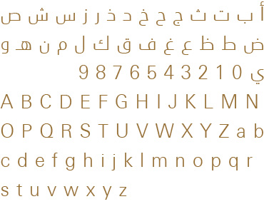
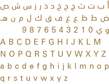
Univers Next Arabic Light

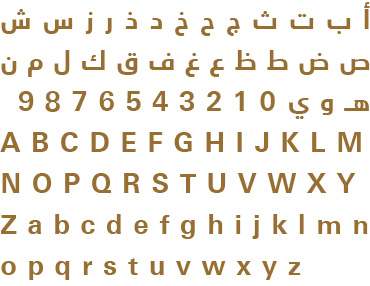
Univers Next Arabic Regular

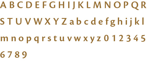
Univers Next Arabic Bold

Keep in mind...

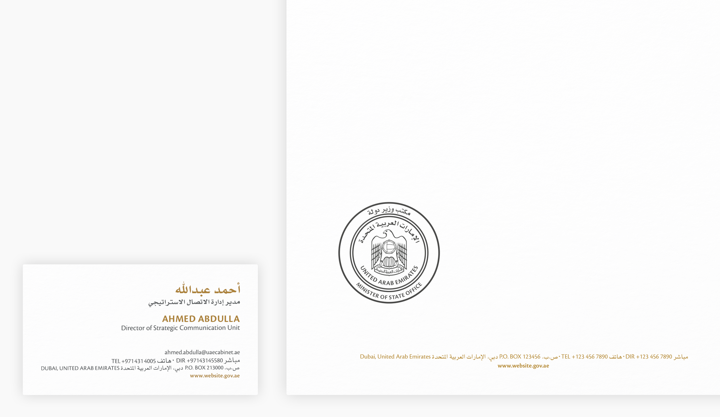
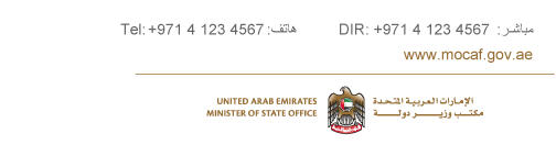
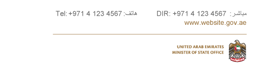
Always use Arabic numerals (keyboard English) to display numbers in both languages.

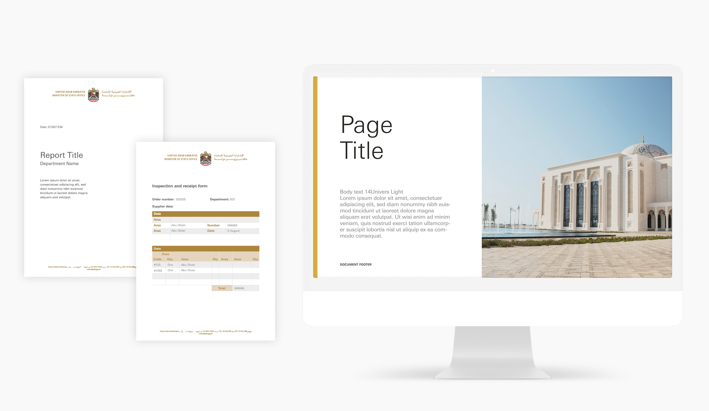
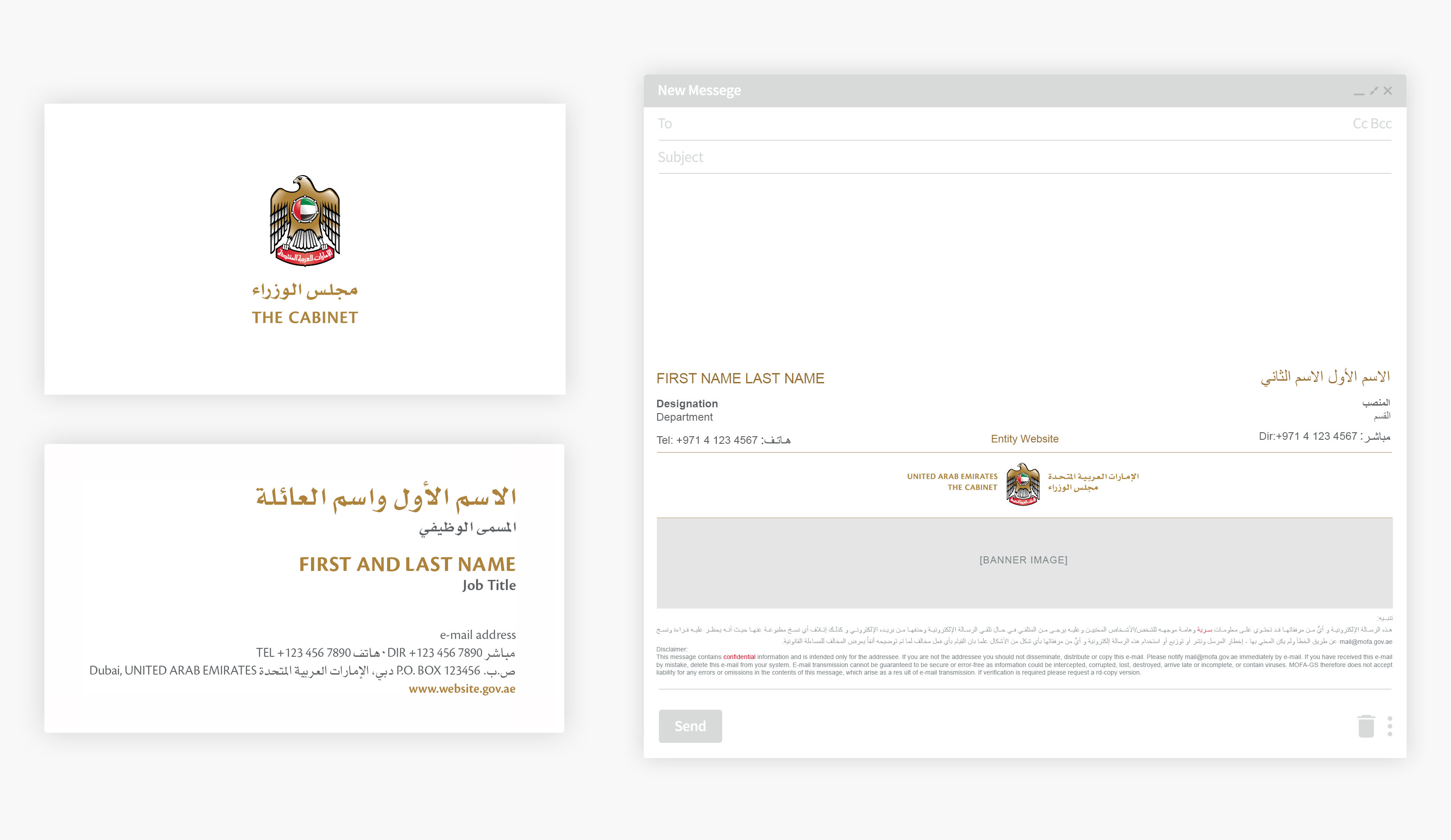
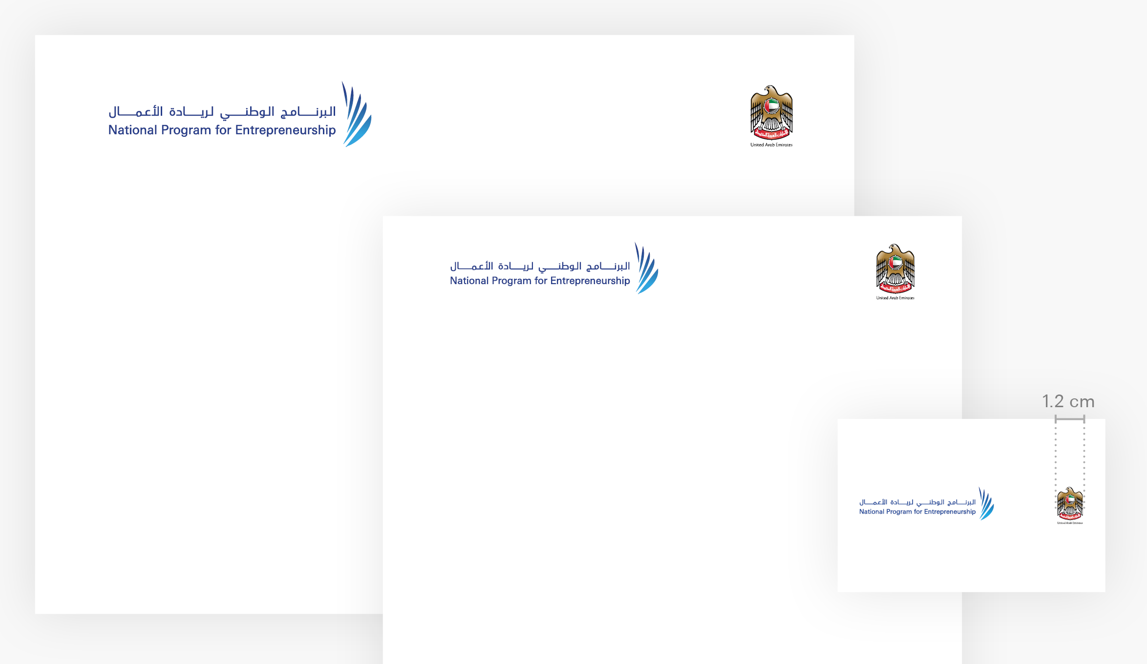
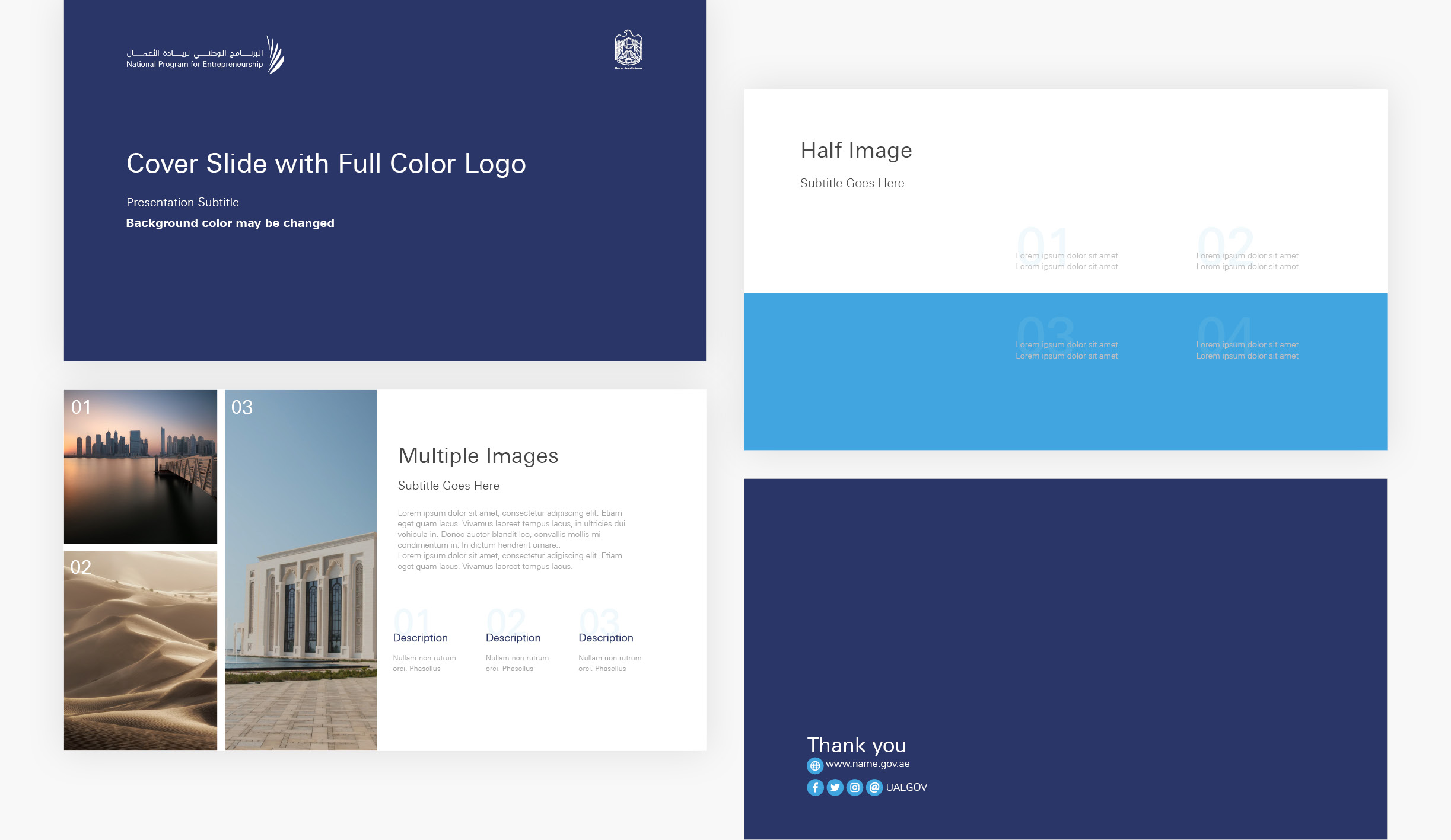
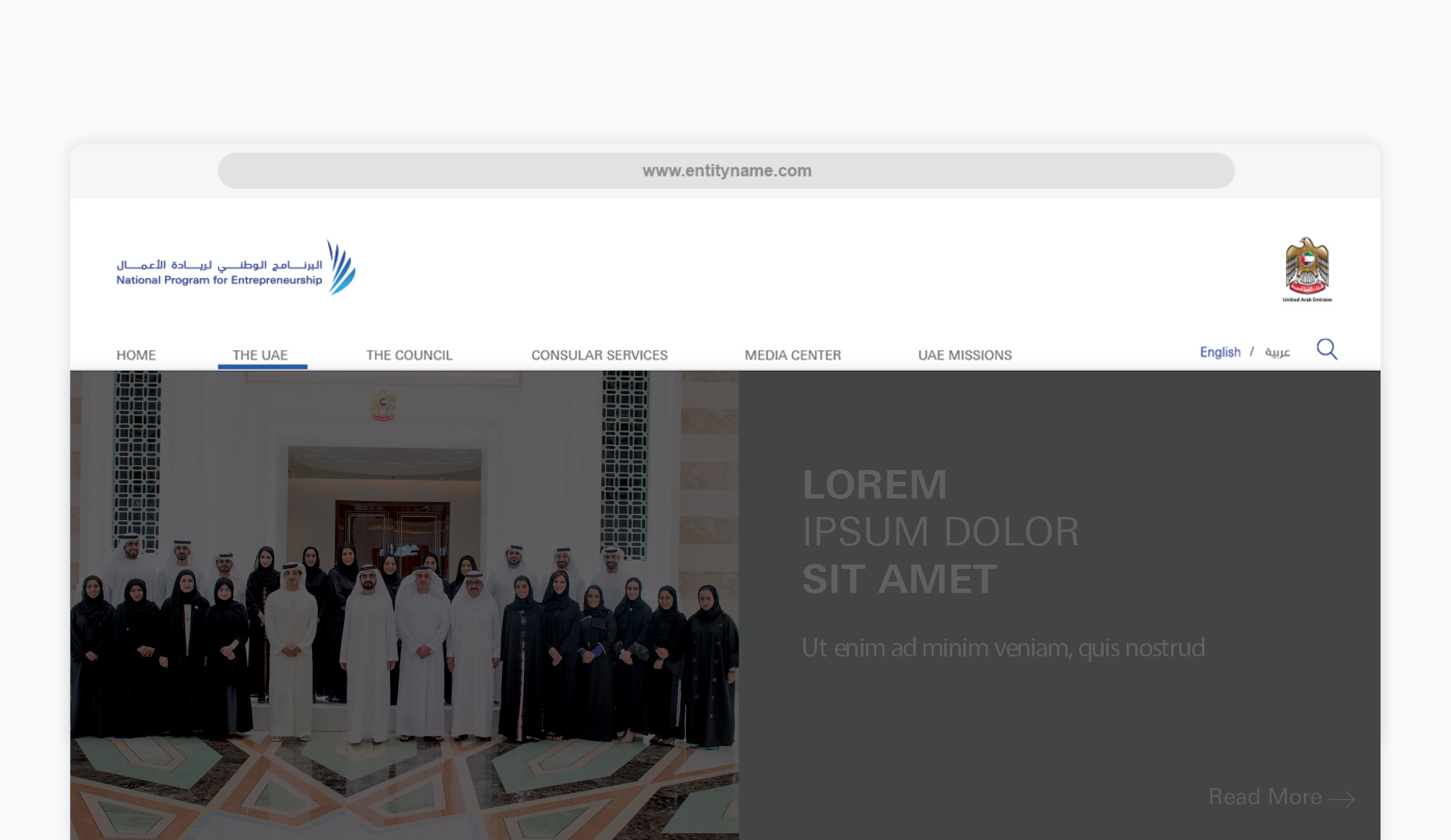
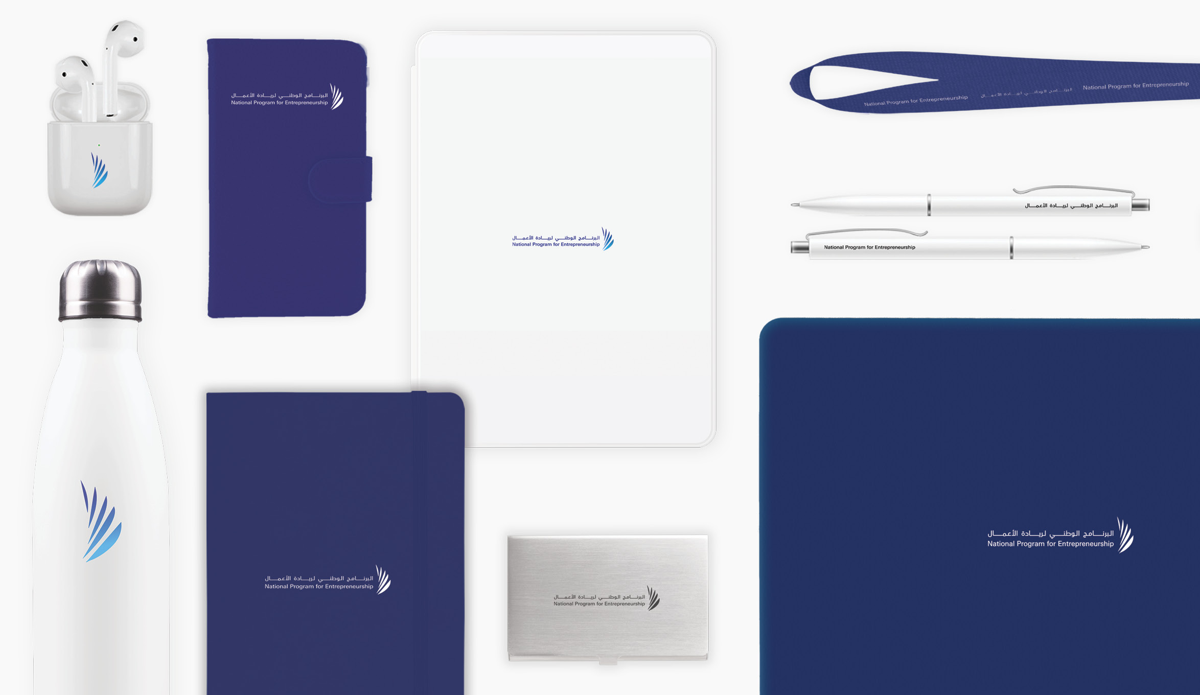
Application Examples
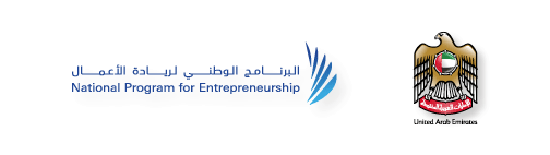
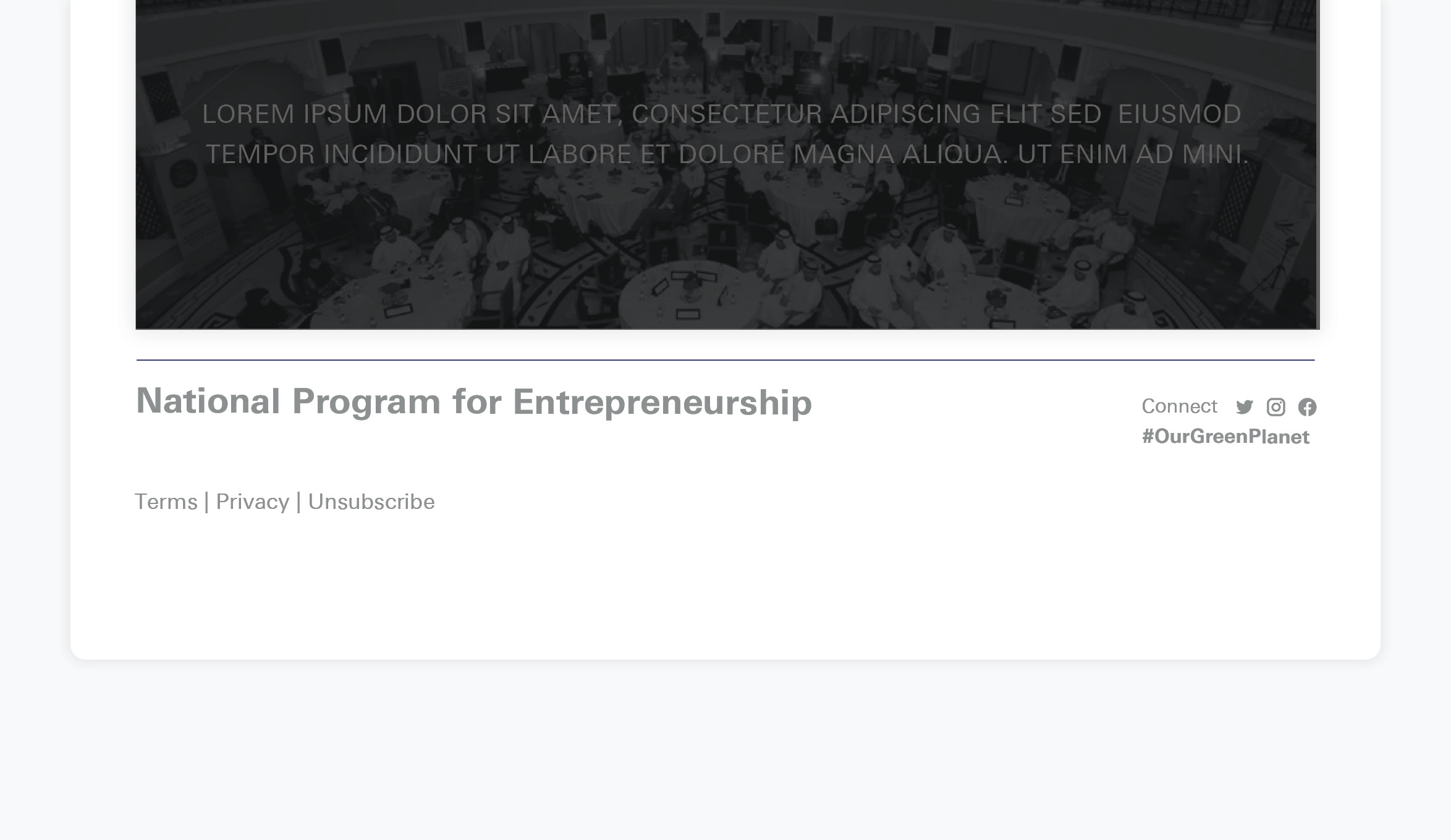
Formal Pairing

Cronos Pro (Latin) and AXT Manal (Arabic) are paired together in federal wordmarks and on official stationery such as business cards, stamps and document footers.

Standard Font Pairing

Cronos Pro Semibold

AXT Manal Bold

Bold Font Pairing

Cronos Pro Bold

AXT Manal Black

Tip!

Use Arial as an alternative font for Univers, Cronos Pro or AXT Manal when needed.

Formal Pairing examples

Typography Principles

Hierarchy

Body Text

Leading

Alignment

Colours

Primary Palette

When used appropriately, colour is one of the most efficient ways to distinguish the UAE government brand and deliver a consistent image.

White

R 225 | G 225 | B 225
C 00 | M 00 | Y 00 | K 00

Silver

Pantone 877 C
R 198 | G 198 | B 198
C 00 | M 00 | Y 00 | K 30

Iron

Pantone Cool Gray C
R 65 | G 64 | B 66
C 00 | M 00 | Y 00 | K 90

Gold

Pantone 8960 C
R 182 | G 138 | B 53
C 17 | M 38 | Y 83 | K 22

Secondary Palettes

Additional colours may be introduced to support the design in subtle ways, like bringing focus to design elements such as buttons or highlights. Remember to use only one of the three colour palettes—never mix! Primary Colour Palette | Secondary Palettes.

Sapphire Blue

UAE Red

UAE Black and UAE Green

Stationery

Office of the Minister Stationery

Lorem Ipsum title 8022

Keep in mind...

Lorem Ipsum is simply dummy text of the printing and typesetting industry note.

Business Card and Email Signature

Keep in mind...

The Cabinet logo is used on ministers of state business cards and email signatures; the Cabinet logo may not be used in any other cases.

Letterhead and Envelopes

Keep in mind...

Official letterheads may be used to produce official letters, reports and forms

Compliments Card and Folder

  • Apply the footer text consistently as on the letterhead.
  • Primary logo size on applications: 1.7 cm.


Essentials

Business Card

  • Only use an individual’s first and last names on the business card. Full names may only be used for the Minister and Director General.
  • URL must be changed according to the entity.
  • Do not use printing methods other than specified.
  1. AXT Manal Regular 25 pt.
  2. AXT Manal Bold 12 pt.
  3. Cronos Pro Bold 10 pt. all caps Gold.
  4. Cronos Pro Semibold 9 pt.
  5. English: Cronos Pro Regular 7/8 pt. | Arabic: AXT Manal Regular 10 pt.
  6. Cronos Pro Semibold 7 pt.

Envelopes

Keep in mind...

Use the same footer text on envelopes as letterheads.

Tip!

You may add a confidentiality strip on the flap of the envelope when needed

Letterhead

  • Arabic: AXT Manal Regular 30 pt.
  • English: Cronos Pro Regular 11 pt.
  • Arabic and English text are aligned to the same baseline.
  • Only use Arabic numerals (keyboard English)
  • Website: Cronos Pro Bold 11 pt.

Tip!

You can use letterheads as the foundation for various applications, including reports and forms. For continuation pages, simply use the letterhead without the footer.

Official Stamps

  1. AXT ManalRegular 9.8 pt. Black
  2. AXT Manal 8 pt. Black
  3. Cronos Pro Regular 4.5 pt. Black
  4. Cronos Pro Regular 5 pt. Black
  • Stamp ink can be red or green and can be numbered.
  • Do not use the minister of state office logo and only use the minister of state office title.
  • Use the official font pairing for stamps.

Email Signatures

Desktop

  • Baseline grid height: 20 px.

Mobile

  • Baseline grid height: 18 px.

Disclaimer

  • Body text: Silver
  • Highlights: Red
  • Arabic: Regular 9 pt
  • English: Regular 9 pt
  1. English Text: Regular 12 pt all caps. Arabic text: Regular 13 pt
  2. English Text: Bold 11 pt Arabic text: Bold 12 pt
  3. English Text: Regular 11 pt Gold
  4. English Text: Regular 12 pt all caps. Arabic text: Regular 13 pt
  5. English Text: Regular/ Bold 11 pt Arabic text: Regular/Bold 12 pt
  6. English Text: Regular 11 pt Gold


Keep in mind...

Email signatures are always bilingual, using the font Arial for both body text and signatures in both languages.

Email Signature Misuse

Do not recolour the text or any other elements.

Do not use fonts other than Arial.

Do not rearrange the text or realign languages.

The email signature should always be bilingual: Do not use one language for the email signature.

Do not resize the logo or alter its proportions.

Only use the primary (winged) logo: Do not use other logo arrangements.

Do not use the single-colour or wordmark logo variations.

Employee ID Card

  1. Arial Regular 12 pt. Gold
  2. Arial Regular 7 pt. Silver
  3. Arial Regular 8 pt. All Caps Gold
  4. Arial Regular 6 pt. Silver
  5. Arial Regular 7 pt. Black
  6. A: Arial Regular 8 pt. Black English: Arial Regular 7 pt. Black


Paper Specifications

Paper Stock: FEDRIGONI, CONSTELLATION SNOW E/E 33 Raster

National Programs and Strategies

Ministers of state must create national programs and strategies to communicate with external audiences about their initiatives and activities.

Program/Strategy Logo Structure

Independent logos may be created for programs/strategies—as long as they adhere to these basic guidelines. All logos must be approved by the UAE Government Media Office.

Wordmark

Must be bilingual, with the name of the program in Arabic on the first line, English on the second. Both lines must be equal in width; use kashidas as necessary.

  • Program/Strategy name in Arabic
  • Program/Strategy name in English

Logo Mark

Always placed to the right of the wordmark.

Tip!

If your entity’s business needs do not align with this logo structure, consult the UAE Government Media Office at [email protected].

Pairing with the Federal Emblem

The UAE Federal Emblem

National programs and strategies can associate their brands with the UAE government by pairing their logos with the federal emblem.

  • Falcon: Watchful, prepared and firmly grounded, the falcon embodies our strength and unity in the present, our pride in our past, and our agility to soar high into the future..
  • The Seven Stars: The seven stars represent the seven Emirates, united around the UAE flag and linked together as one by an unbreakable ring.
  • Calligraphy: The “United Arab Emirates” is etched on a red banner, weaving together the richness of our heritage and the elegance of our progress.

Federal Colour Palette

Gold

Pantone 8960 C
R 182 | G 138 | B 53
C 17 | M 38 | Y 83 | K 22

Red

Pantone 186 C
R 200 | G 16 | B 46
C 00 | M 100 | Y 85 | K 06

Green

Pantone 348 C
R 0 | G 132 | B 61
C 96 | M 02 | Y 100 | K 12

Black

Pantone Black C
R 0 | G 0 | B 0
C 10 | M 10 | Y 10 | K 100

Pairing Application

Mandatory Emblem Application

These are items where national programs and strategies must use the UAE federal emblem and must be produced exactly as specified in these guidelines, including paper specifications.

  • Letterhead for MOU signing.
  • Website header.


Prohibited Emblem Application

These are items where national programs and strategies are prohibited from using the federal emblem.

  • Social media.
  • Gifts and giveaways.
  • Co-branding.
  • Sponsorships.
  • Vehicle branding.

Pairing Structure

  • The federal emblem is always placed to the right of the logo.
  • The federal emblem and logo must have the same height (x).
  • The height of the logomark must match the height of the federal emblem.
  • The distance between the federal emblem and logo must be at least equal to the emblem’s height (x).
  • The federal emblem and logo must be aligned to the middle.

Keep in mind...

Do not pair the vertical logo arrangement with the UAE federal emblem—only horizontal.

Clear Space

As a general rule, the minimum clear space around the pairing lockup on all sides is equal to ⅓ the federal emblem’s height.

Alignment and Minimum Size

The logo and emblem are always aligned to the header margins, with the program/strategy logo on the left and the federal emblem on the right. The minimum size the emblem can be is 1.2 cm wide.

Logo on Different Backgrounds

When choosing the most appropriate logo treatment on different backgrounds, always aim for maximum contrast for maximum visibility, legibility and impact.

White Backgrounds

Always use the full-colour logo and federal emblem.

Dark Backgrounds

Use the logo and federal emblem in white.

Light Backgrounds

Use the logo and federal emblem in black.

Images

Avoid placing the federal emblem on images.

Federal Emblem Misuse

It is always best to use the federal emblem as it is, without any manipulation or modification.

Do not manipulate the federal emblem in any way (colours, effects, stretching, flipping, shadows…).

Do not use the federal emblem on its own without the entity's logo. The UAE federal emblem on its own may only be used by the president and prime minister.

Avoid placing the federal emblem on images; when necessary, use the appropriate endorsement line instead.

Do not pair the federal emblem with the vertical logo arrangement.

Do not change the logo-emblem pairing alignment or structure.

Do not use any of the federal emblem or any of its elements to create new graphics such as patterns or new marks.

When resizing the logo, always resize the emblem as well in order to maintain the composition and proportions of the logo-emblem pairing.

Do not change the colour of the federal emblem.

Co-Branding

Multiple Federal Entities

When several government entities are co-branding, the logos are displayed in silver (except ministries and local governments) to provide a sense of cohesion among the entities, in addition to reducing visual clutter.

Sponsorship Hierarchy

When several government entities appear together, they do so in this specific order.

Tip!

Keep logo alignments as consistent as possible. Logos should be similar in size and colour treatment, and should all be in either vertical or horizontal arrangements—not a mix of both.

Endrosement Lines

Aligned to the middle of the supporting logos; placed to the left if the design is in English, to the right if in Arabic.

Centered above the supporting logos. This arrangement is most suited for bilingual layouts.

Above the supporting logos, aligned to the left if the layout is in English, to the right if it is in Arabic.

Recommended Endorsement Lines

  • Type: Cronos Pro Semibold, all caps, silver.
  • Ensure that the size is readable and compatible.
  • Ensure that the endorsement line does not intrude on the supporting logos by maintaining sufficient clear space around them.

Co-Branding with Multiple Entities

The federal emblem may only be used in the main header when the entity is the leading/host brand. Supporting entity logos are placed in the footer with the appropriate endorsement line.

With other entities

With multiple ministries

With multiple supporting entities

Co-Branding with Equal Partners

When co-branding with a partner—as opposed to co-branding with a supporting entity or sponsor—the program/strategy uses its own logo only and drops the logo-emblem pairing.

Partner and Supporting Entities

With a Ministry

With a Federal Entity

Program/Strategy as a Sponsor

When a program/strategy supports another brand, place the logo either in the top-right opposite the main brand’s logo; or at the bottom-left, aligned to the main brand’s logo at the margin.

Stationery

Letterhead

  • Arabic: AXT Manal Regular 30 pt.
  • English: Cronos Pro Regular 11 pt.
  • Arabic and English text are aligned to the same baseline.
  • Only use Arabic numerals (keyboard English)
  • Website: Cronos Pro Bold 11 pt.

Tip!

You can use letterheads as the foundation for various applications, including reports and forms. For continuation pages, simply use the letterhead without the footer.

Certificates

A3 Size

  • Margins: 1.2 cm.
  • Border: 2 pt.
  • Logo: Primary or horizontal if co-branding, emblem width 1.8 cm.
  1. Cronos Pro Semibold all caps 48 pt.
  2. Cronos Pro Regular 18 pt.
  3. Univers Next Regular 12 pt.
  4. Name in Univers Next Bold 14 pt. Title in Univers Next Regular all caps 12 pt.

A4 Size

  • Margins: 0.75 cm.
  • Border: 1.5 pt.
  • Logo: Primary or horizontal if co-branding.
  • Emblem width 1.5 cm.
  1. Cronos Pro Semibold all caps 24 pt.
  2. Cronos Pro Regular 28 pt.
  3. Univers Next Regular 12 pt.
  4. Univers Next Regular 12 pt. Title in Univers Next Regular all caps 10 pt.
  5. Title in Univers Next Regular all caps 10 pt.

Vehicle Branding

National programs and strategies may use their own brand identities to brand service vehicles, and must not use the federal emblem for vehicle branding.

Powerpoint And Presentations

  • The federal emblem may only be used on the cover page.
  • The entity’s logo must not be used on inner slides.
  • Include social media handles on the last page.

Paper Specifications

Paper Stock: FEDRIGONI, CONSTELLATION SNOW E/E 33 Raster

Website

Every entity’s website should cater to its own requirements in terms of content. However, what all authority websites have in common are the proper logo-emblem pairing treatment and three essential components.

Contains the logo-emblem pairing, flushed to the margins. The emblem’s minimum width is 75 px, and the minimum clear space around the logo and the emblem is 68 px from all sides.

Displays relevant authority content, such as the latest news. This component may be a slider, a media wall or any other appropriate design solution, according to the authority’s needs

Includes contact information and other relevant links, such as the terms of use, privacy policy, careers, social media links or copyrights.

Keep in mind...

The standard font for is Univers Next.

Social Media

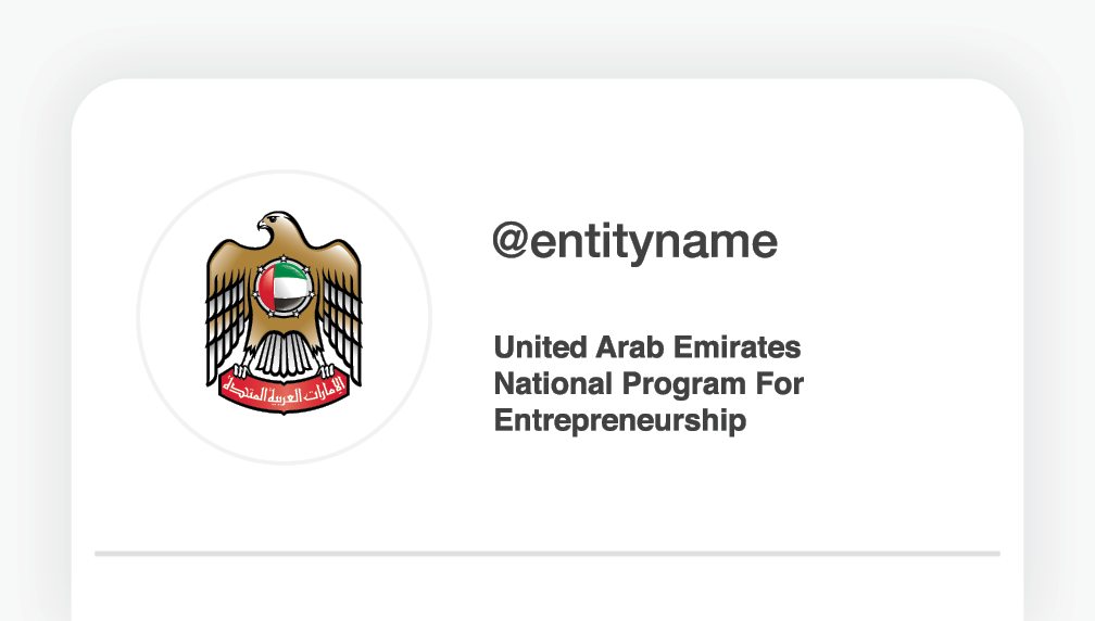
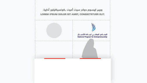
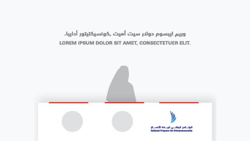
In the profile section, include the program/strategy’s name in Arabic and English along with a link to the entity’s website.

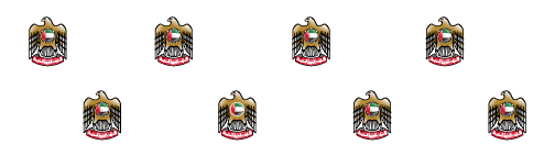
Display picture: Full-colour logomark, centred on a white background with sufficient clear space around it.

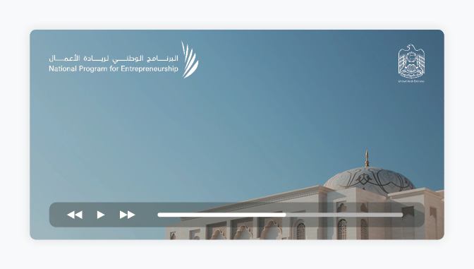
Do not use the federal emblem as a display picture on any digital platform.

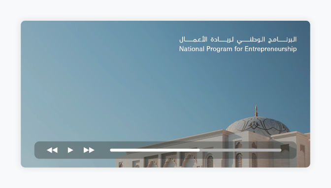
Use the wordmark on posts instead of the logo.

Do not use the federal emblem on social media posts.

Logo in Videos

The logo may be used in videos to indicate the entity’s ownership or endorsement. As a rule, the logo (with the logomark) only appears in video outros and never over video footage. A watermark may be used for the duration of the video; using the full entity name in Arabic and the abbreviated name in English under it, positioned in the top-right corner of the video.

The logo may only appear in the outro of the video.

Do not animate the logo components; only simple transition effects, such as fading in and out, are allowed.

The watermark (without the logomark and emblem) may be placed in the top-right corner over video footage.

Never use the logo or the emblem as a watermark on video footage.

Keep in mind...

In co-branding situations, logos may only appear in the outro of the video, following the Co-Branding guidelines.

Events and Exhibitions

Media Wall

Use a step-and-repeat pattern for media wall backdrops at events and exhibitions, ensuring sufficient clear space around the logos.

  • Titles may be added above the logos.
  • When using the federal emblem, make sure the logo-emblem pairing rules are applied correctly.
  • In co-branding situations, use the logo without the federal emblem; remember to use similar logo sizes, treatments, and arrangements according to the co-branding guidelines.

Exhibition Booths

The logo-emblem pairing is placed prominently and without repetition. The logo-emblem pairing may also be displayed digitally on a screen.

  • Entities have the freedom to construct the most appropriate booths to serve their specific needs.
  • The logo-emblem pairing may also be displayed digitally on a screen.

MOU Signing

Co-branding with one entity

Co-branding with two entities or more

Signing Agreement

The first page of an agreement is always printed on the official letterhead, with the subsequent pages printed on continuation sheets. Co-branding on a signing agreement is not allowed. Each party signing the agreement will have an agreement prepared with their own official logo.

Tip!

MOU signing designs follow the co-branding guidelines, so a program uses its own logo without pairing with the federal emblem.

Gifts and Giveaways

Entities use their own brands on gifts and giveaways, without using the federal emblem.

Link Copied