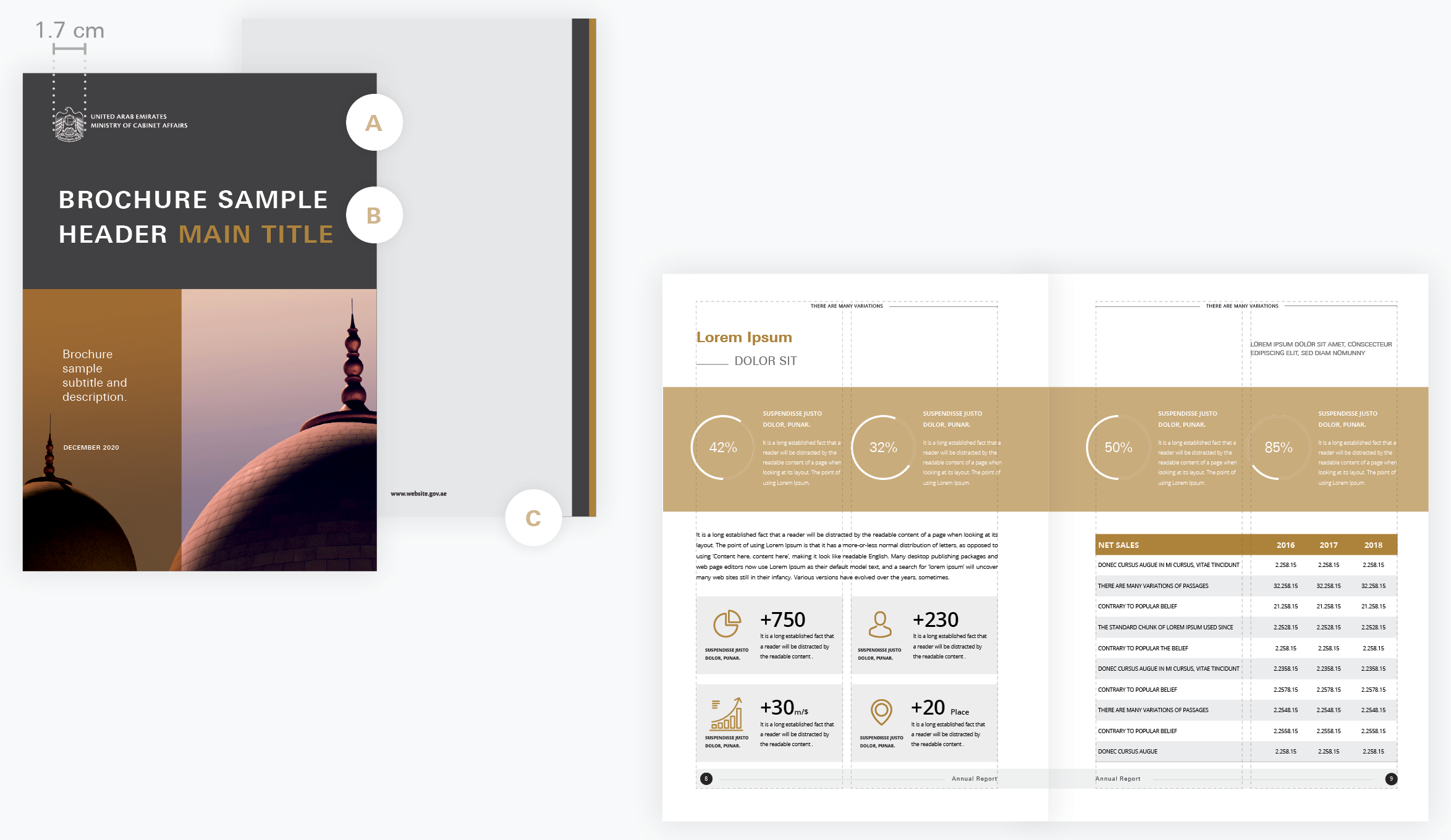
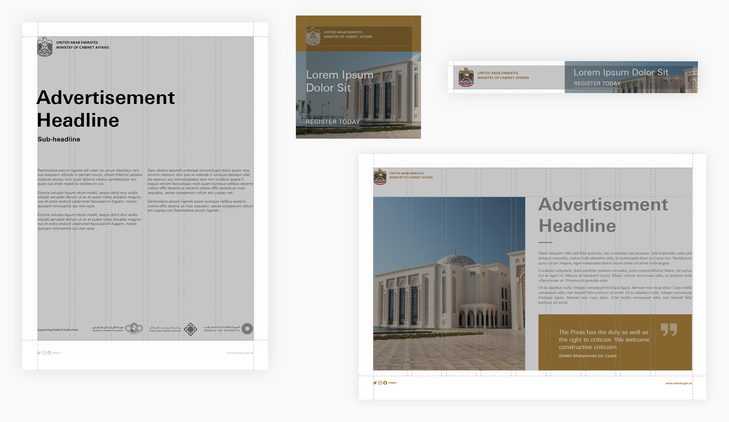
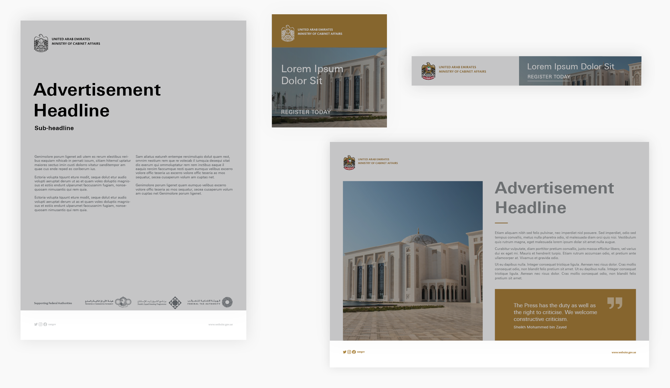
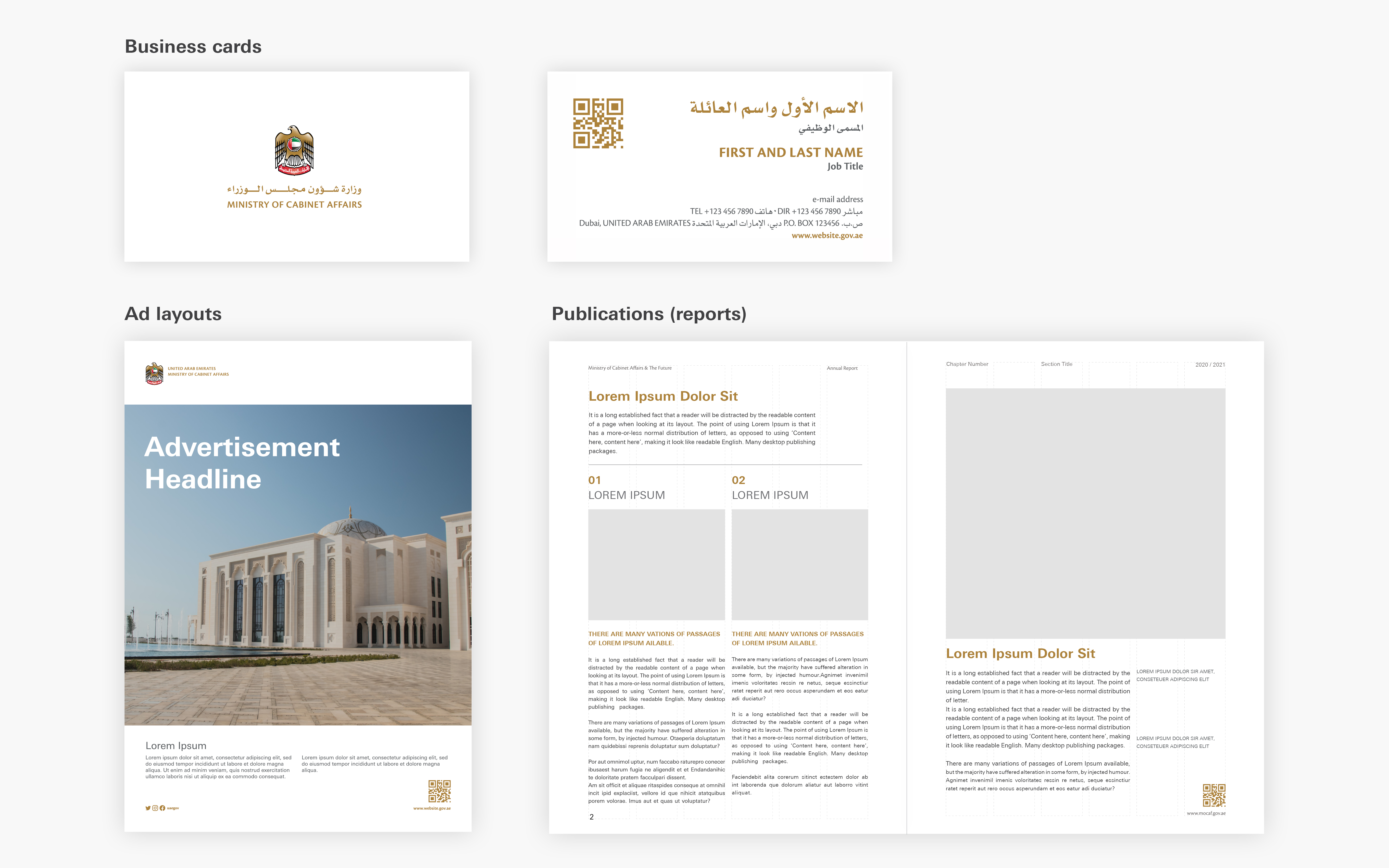
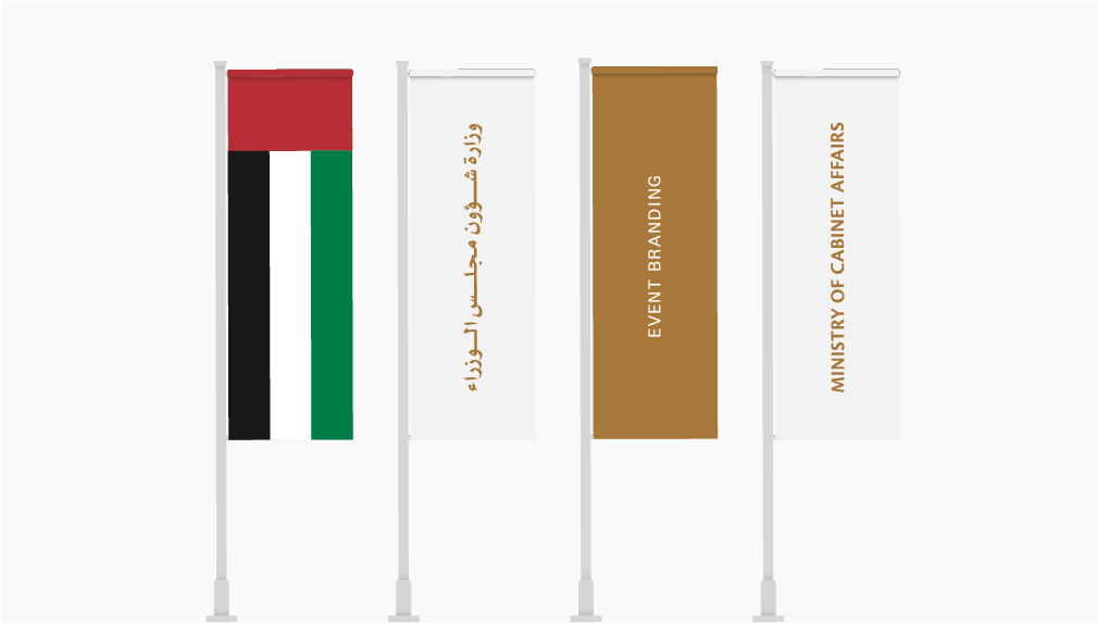
Modernity
Our advertising carries the elegance and forward-thinking of the UAE. Our choice of imagery, messaging and layout is clean, harmonious and elegant.
Objectivity
We always aim for accuracy in the presentation of all facts, ensuring that all statements and claims included in the advertisements have sufficient proof.
Inclusion
The UAE is wonderfully rich in its cultural diversity, and our communication creates an environment where people from all walks of life can feel a sense of belonging.
Environmental Responsibility
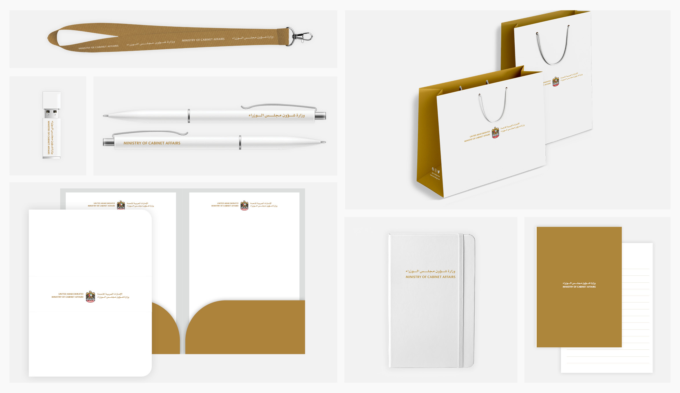
We always consider the impact of the production and dissemination of our materials through the most appropriate and responsible means.
Empathy
We are considerate of our audience’s experiences and how our language and communication can impact the way they absorb and respond to our messages.

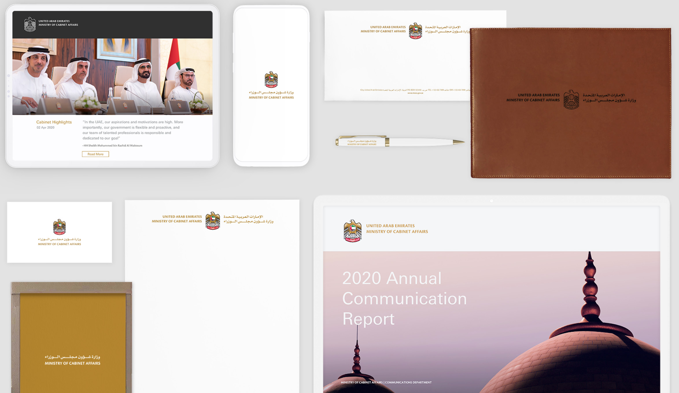


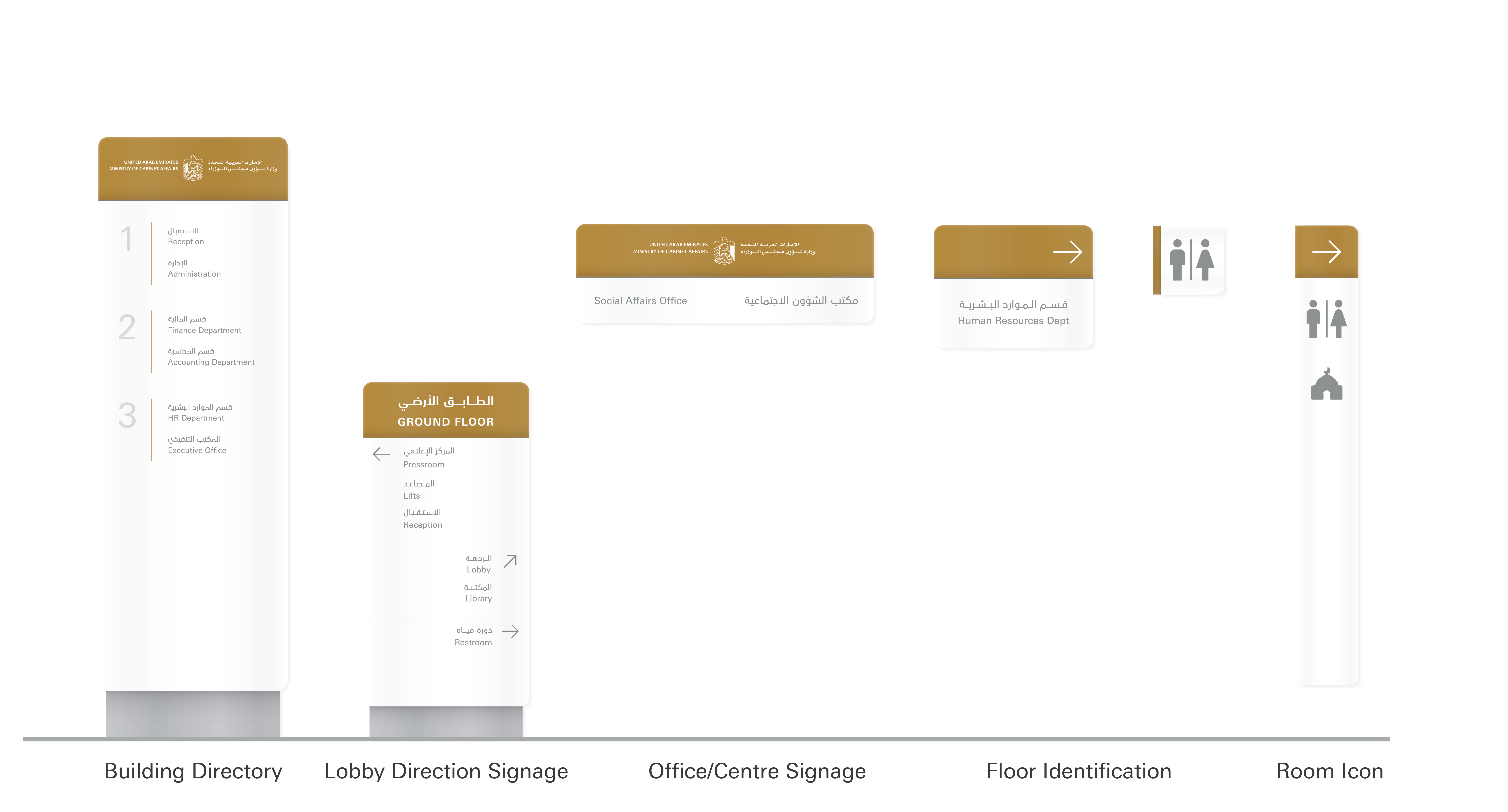
Social Media and Mobile Apps
Profiles
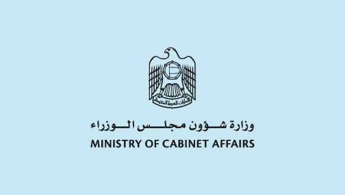
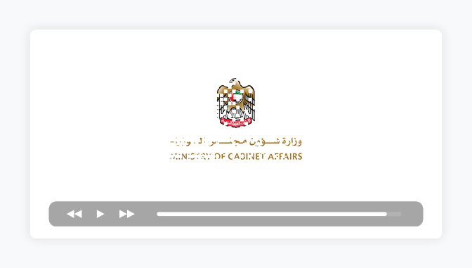
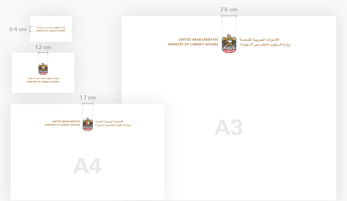
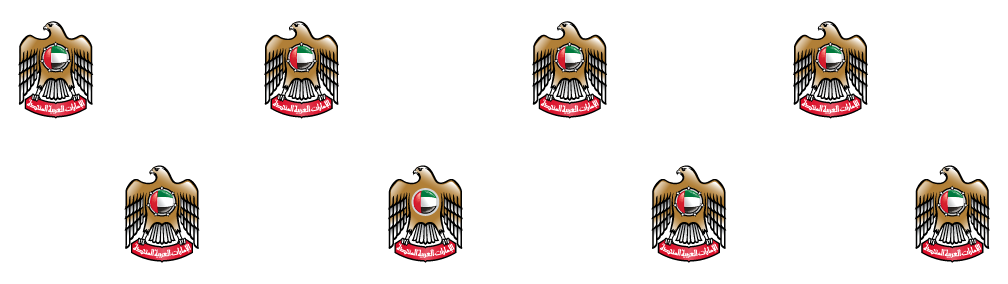
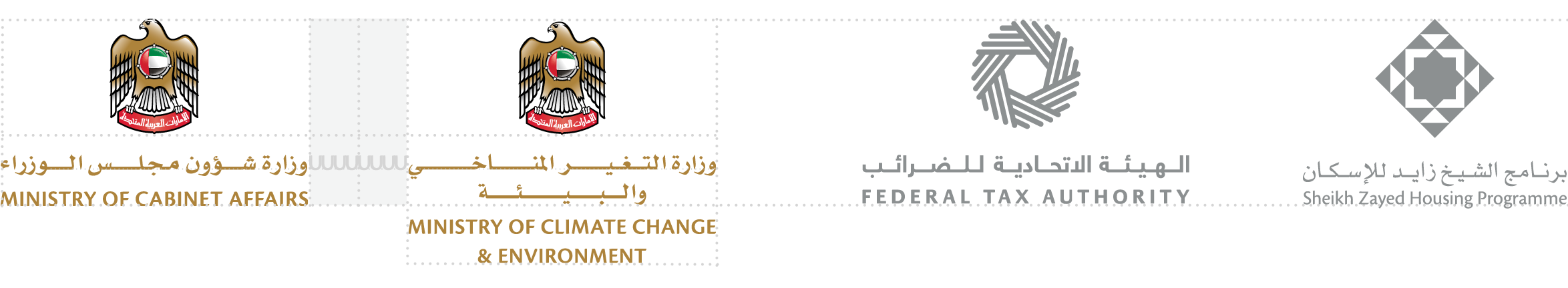
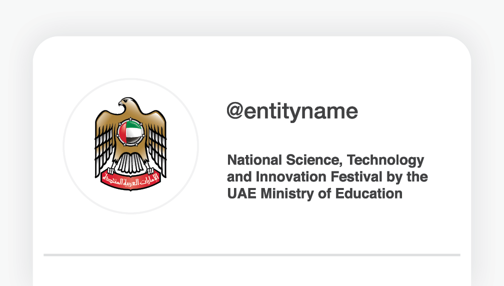
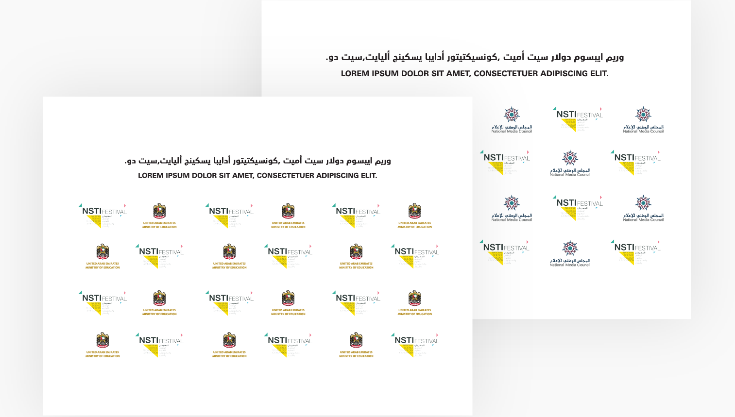
All ministries must use the federal emblem for their display pictures on social media channels. The emblem is always in full-colour, centred on a white background with sufficient clear space around it. Ministries must use the full ministry name in both Arabic and English on the profile information.
The full-colour emblem is used for official profile display pictures.
Do not use the single-colour or full logo (with wordmark) as a display picture.
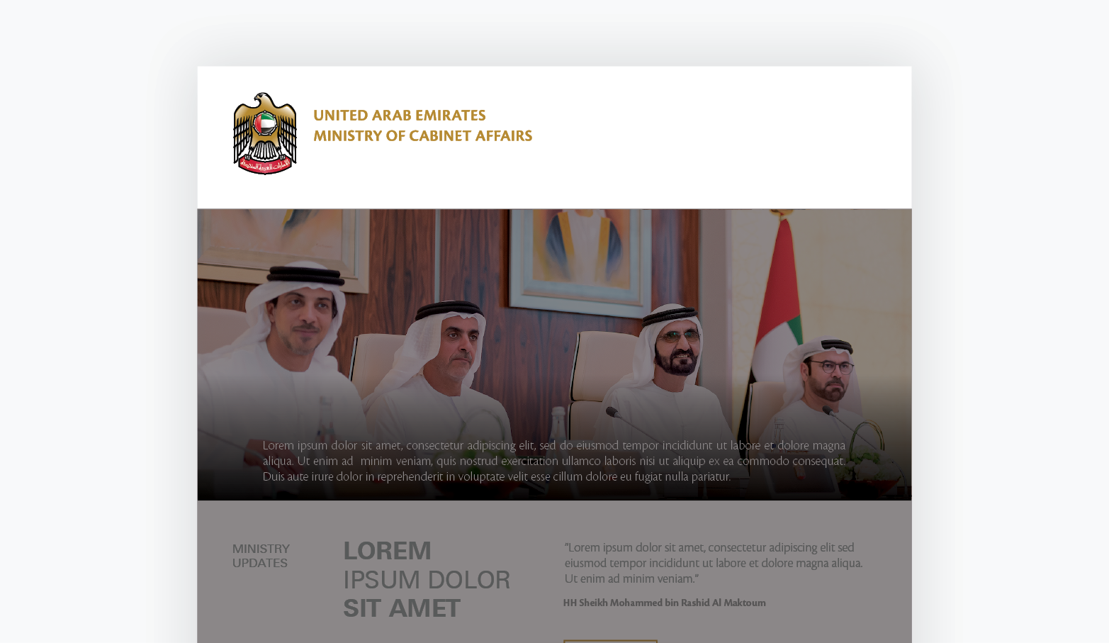
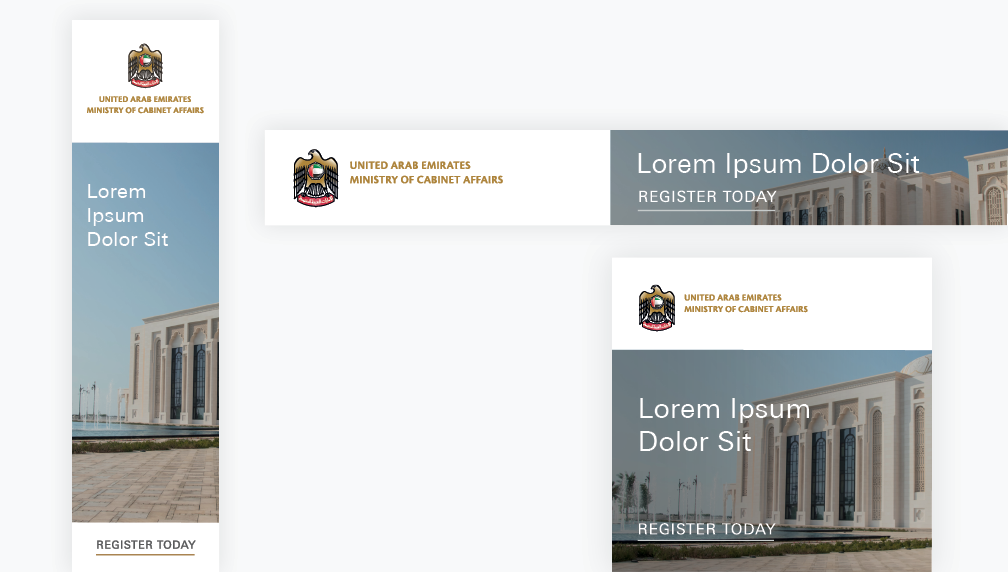
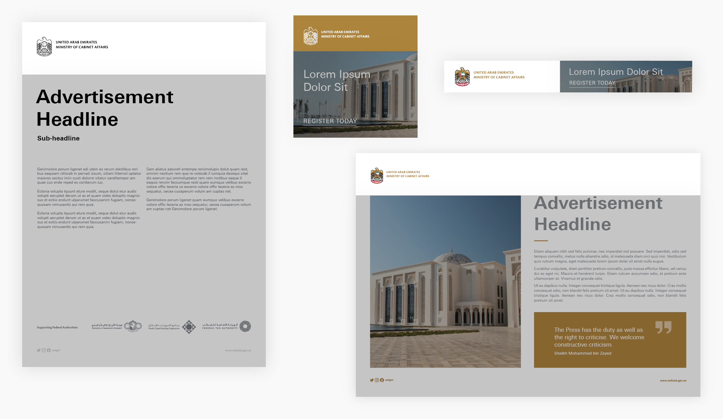
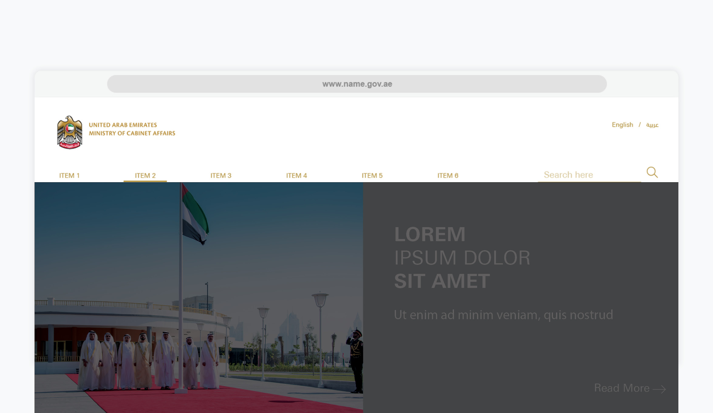
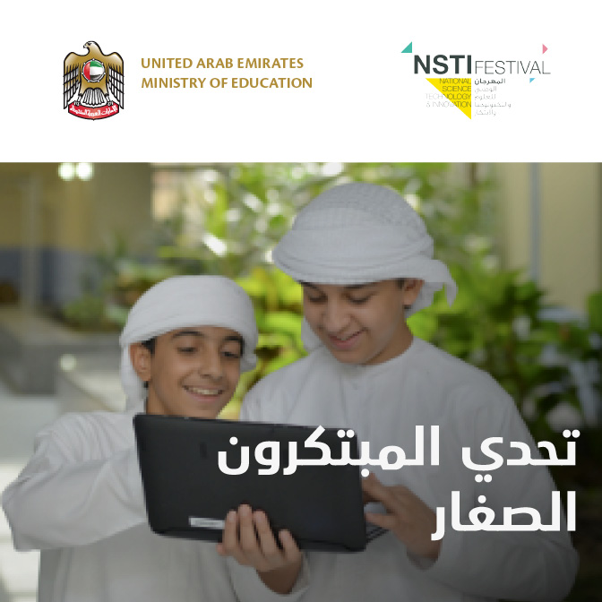
Page Banners
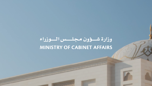
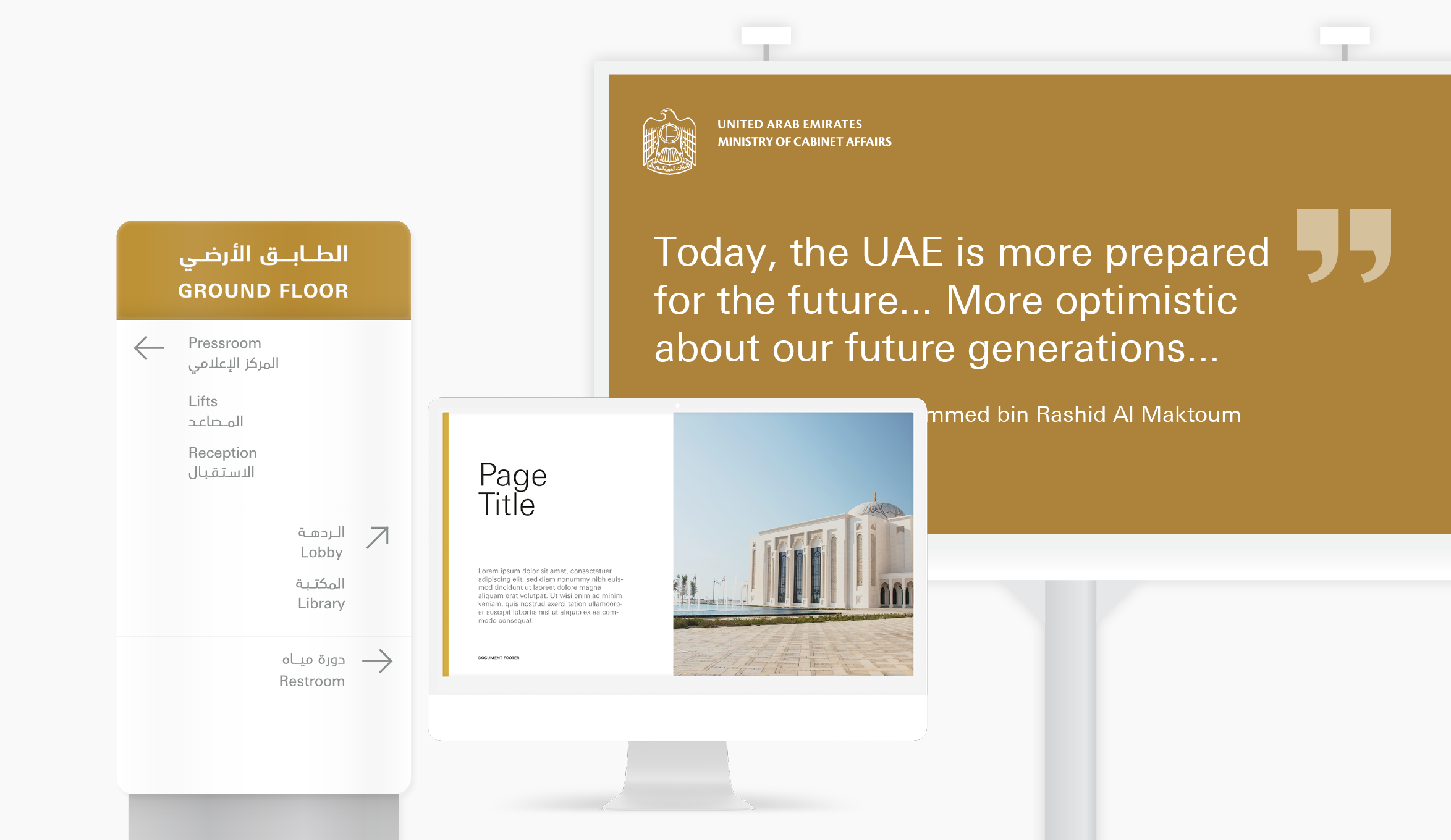
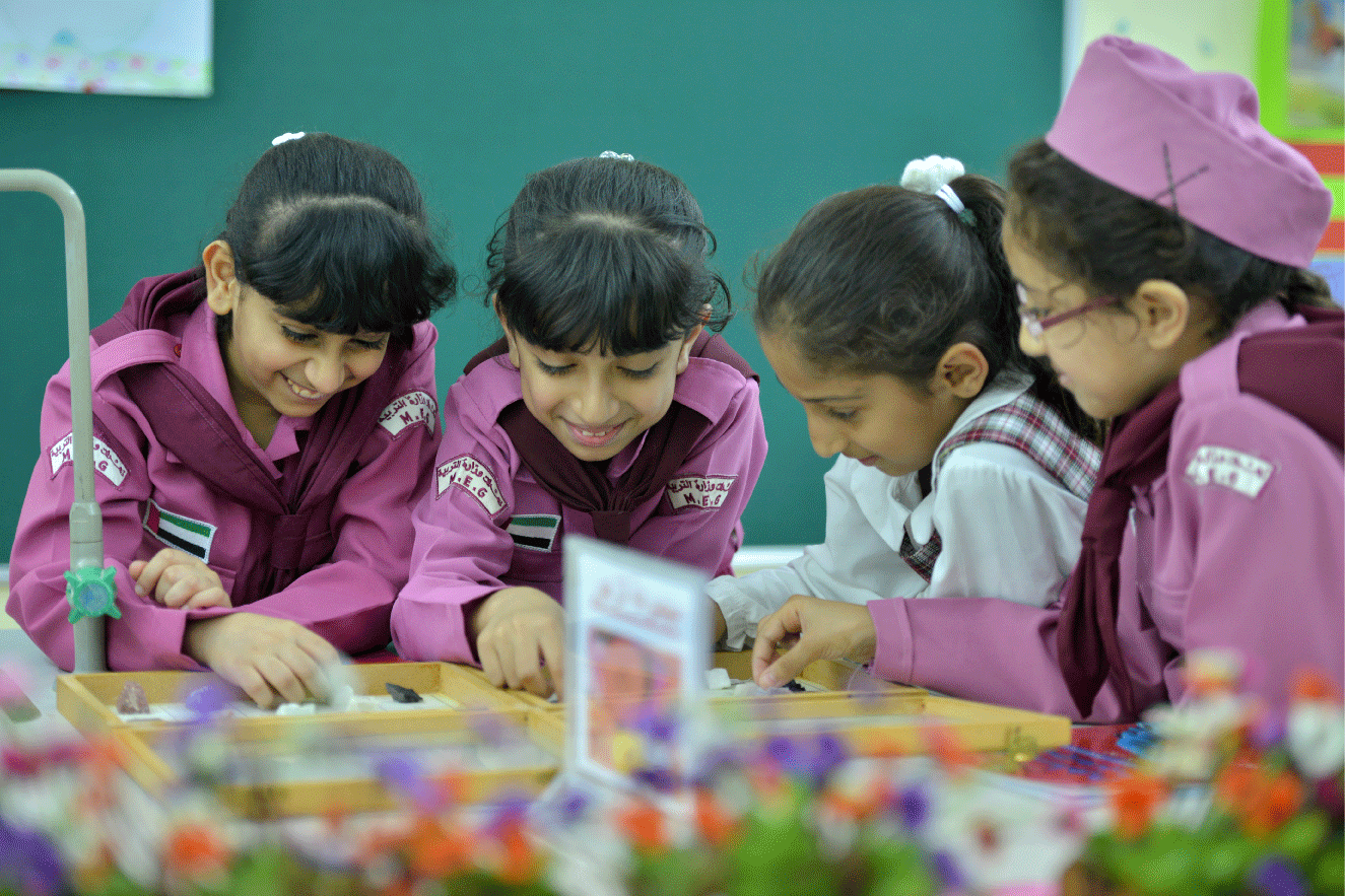
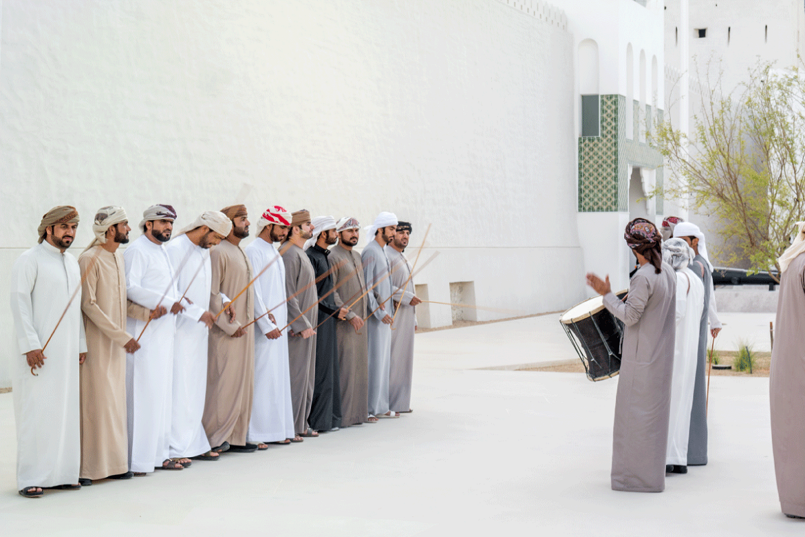
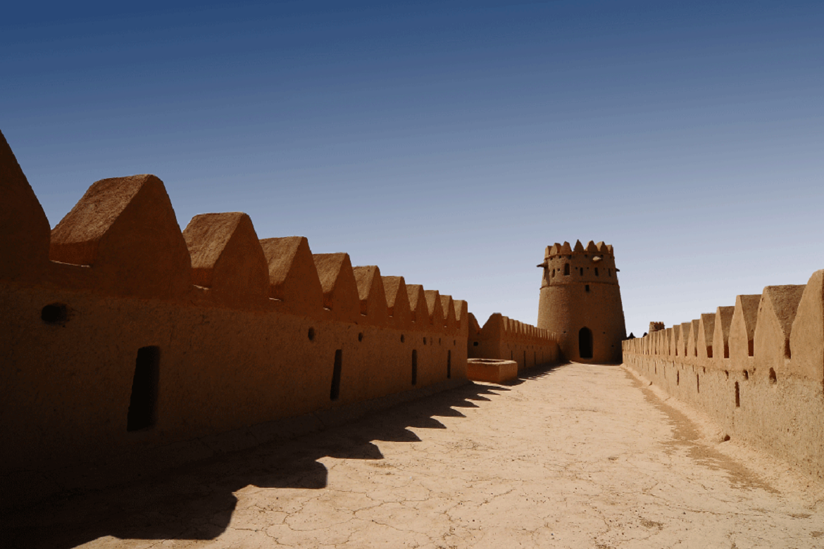
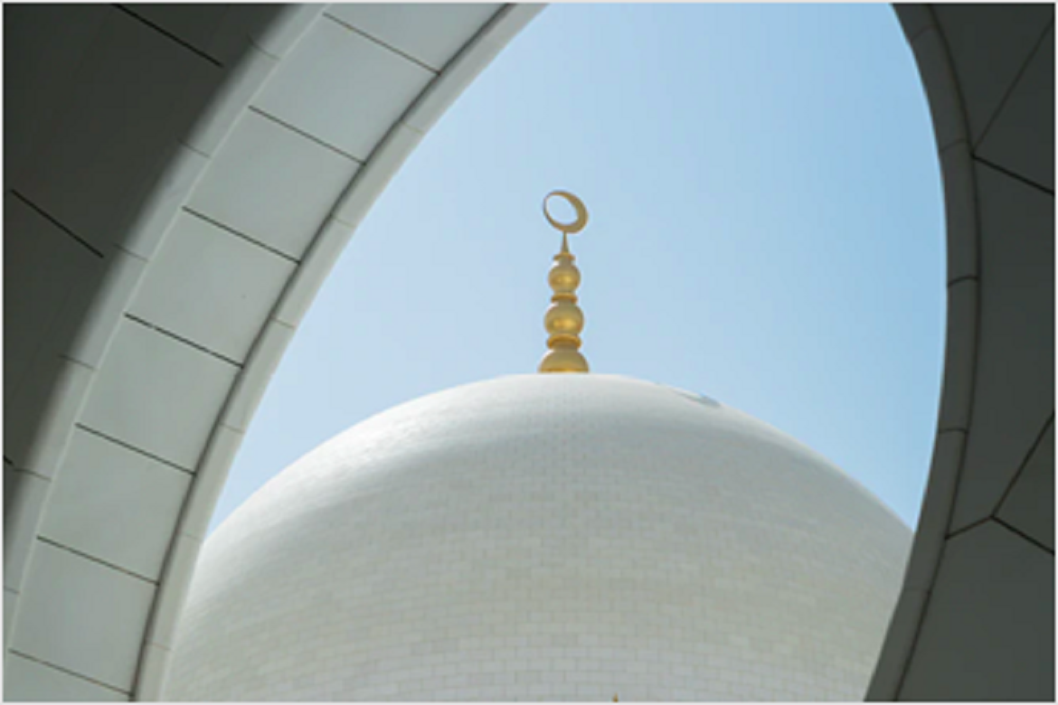
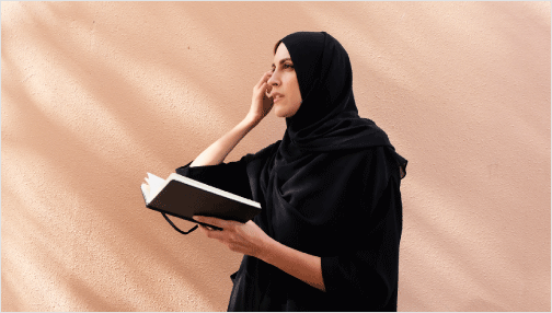
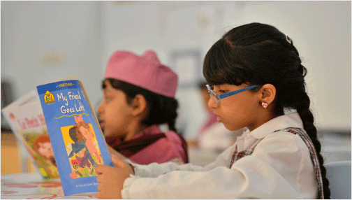
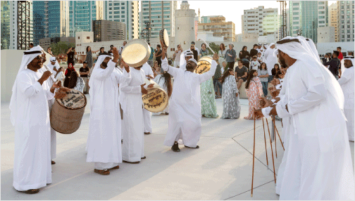
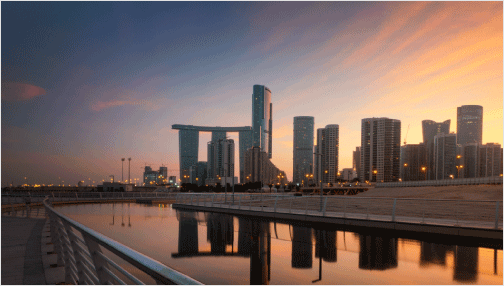
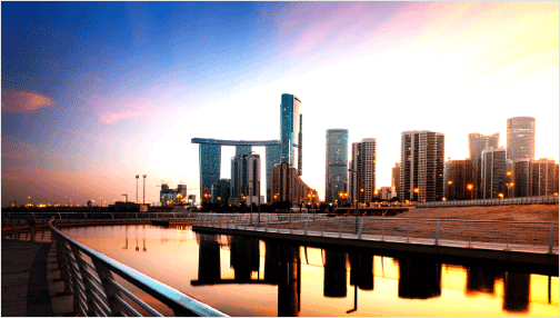
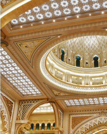
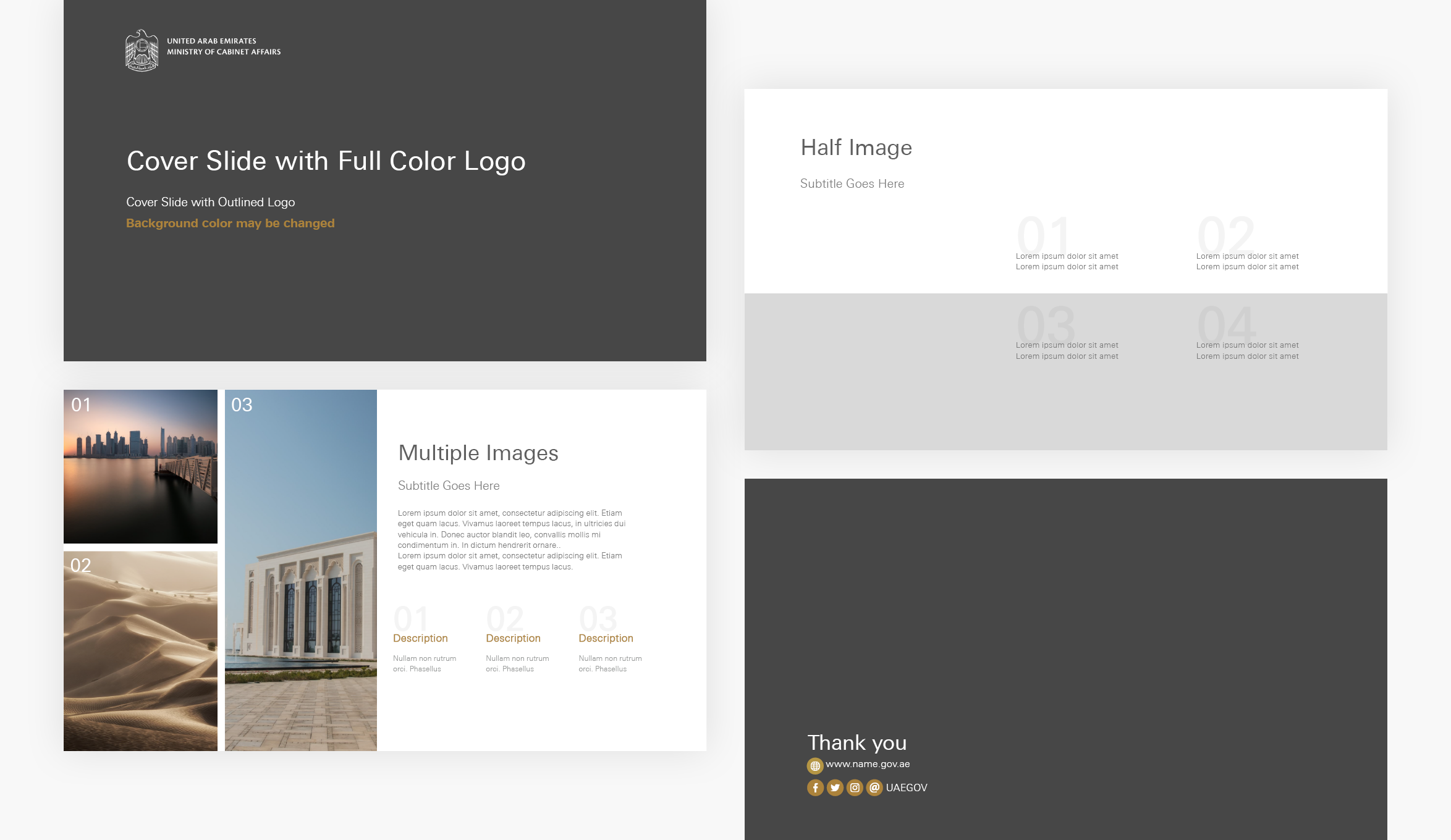
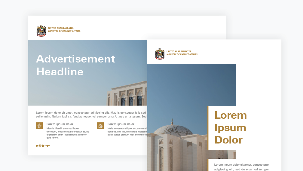
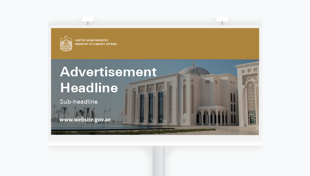
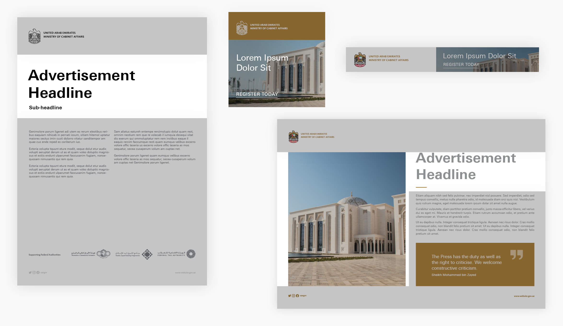
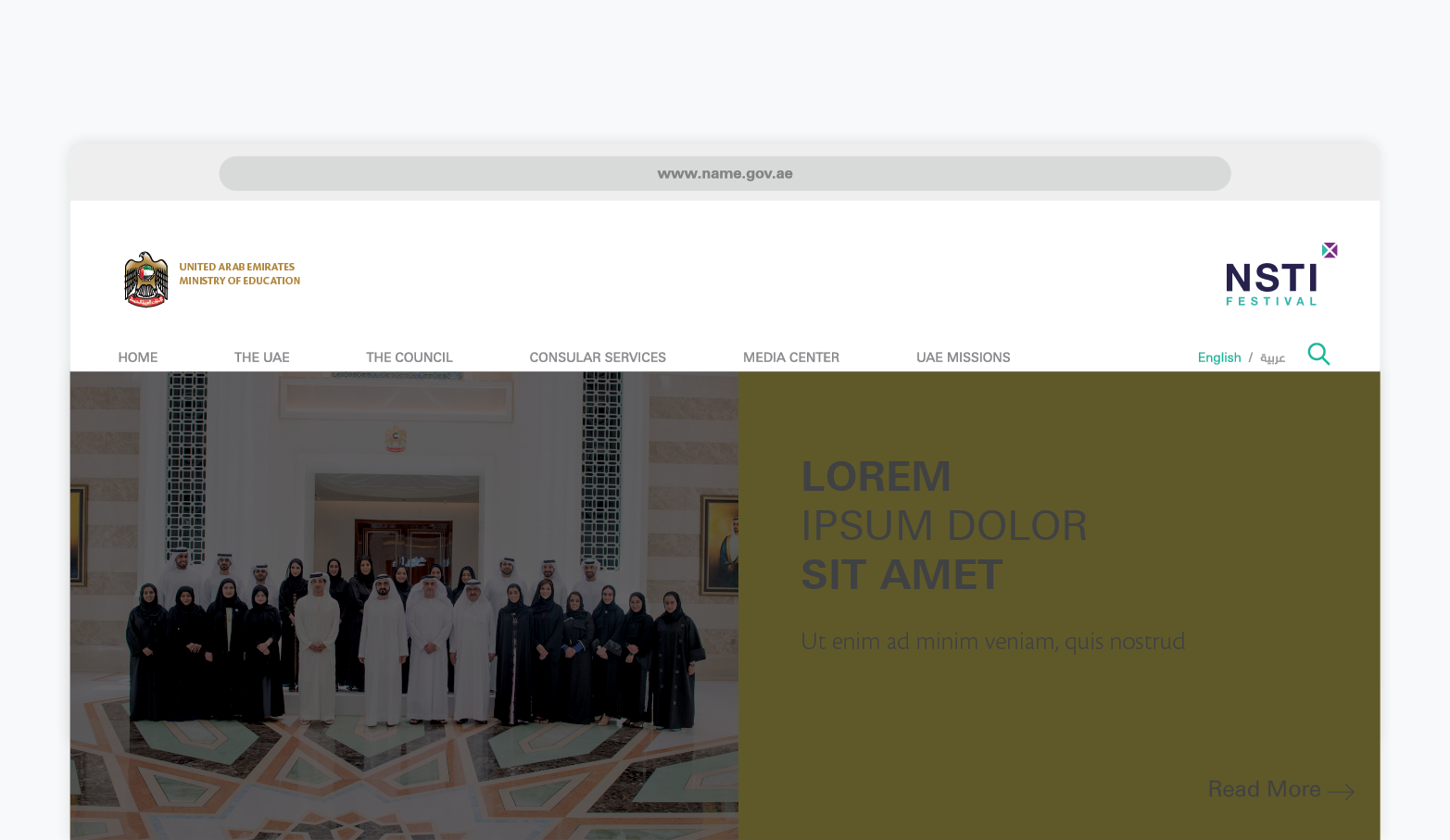
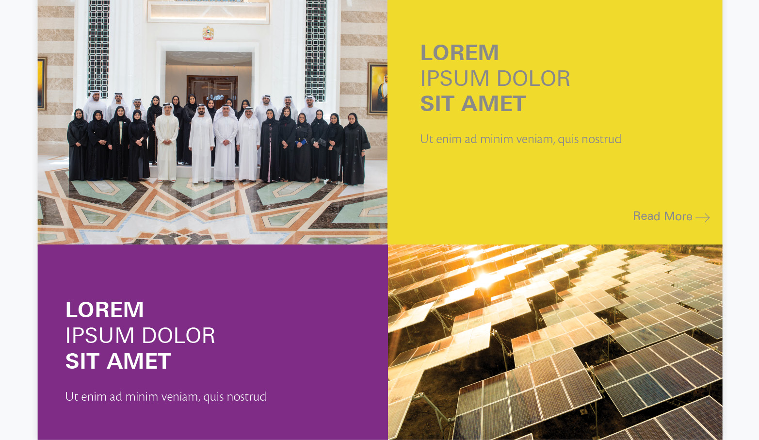
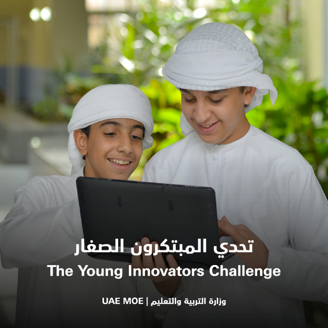
You are encouraged to use images or visuals relevant to the ministry’s responsibilities, in line with the photography guidelines. Images should be ideally cropped, particularly when images include people.
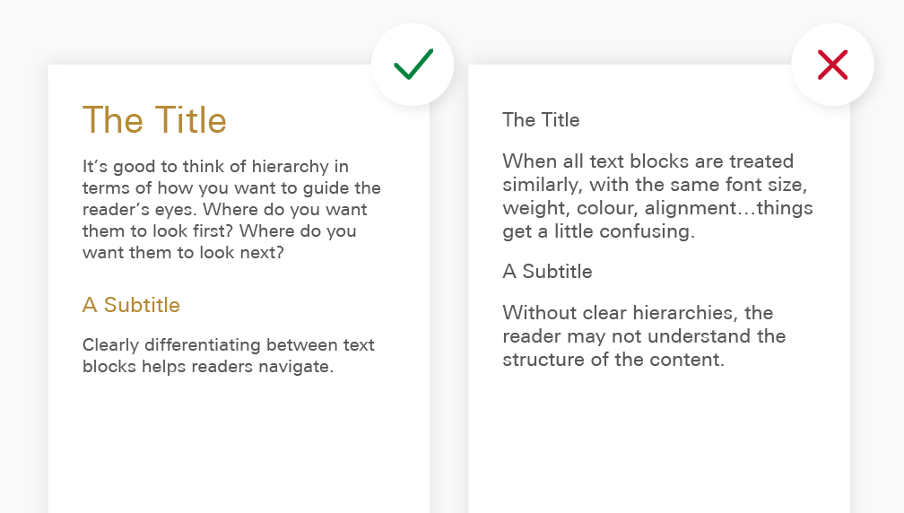
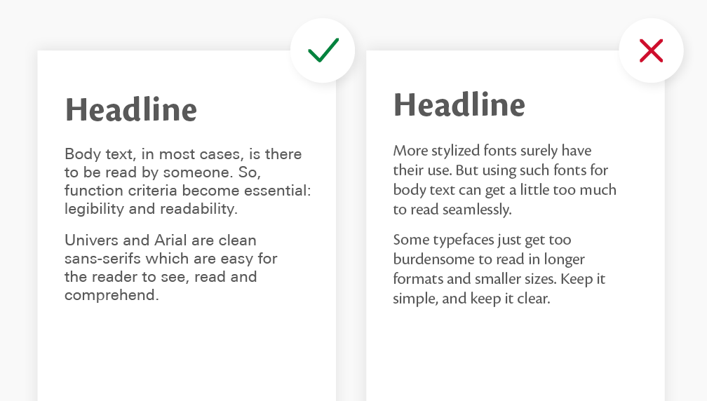
Good cropping
Bad cropping
Keep in mind...
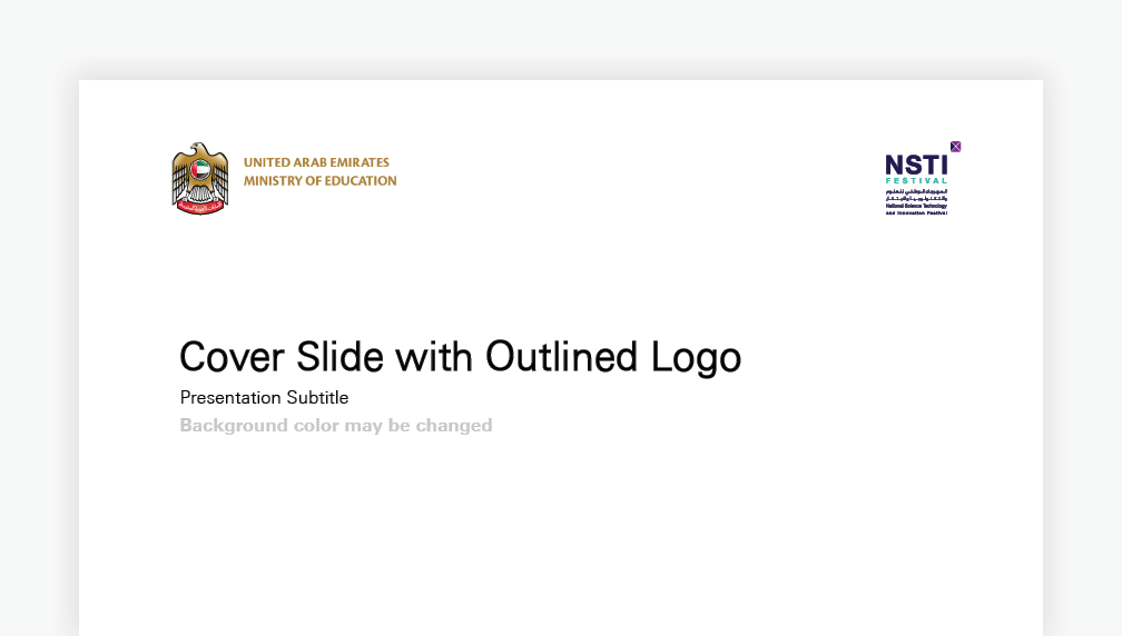
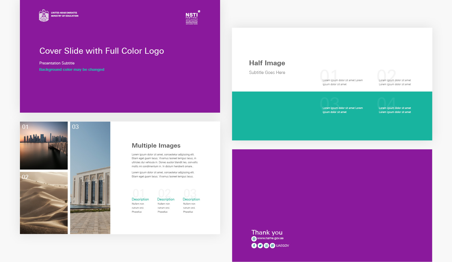
Do Not use the federal emblem on banners or cover pages.
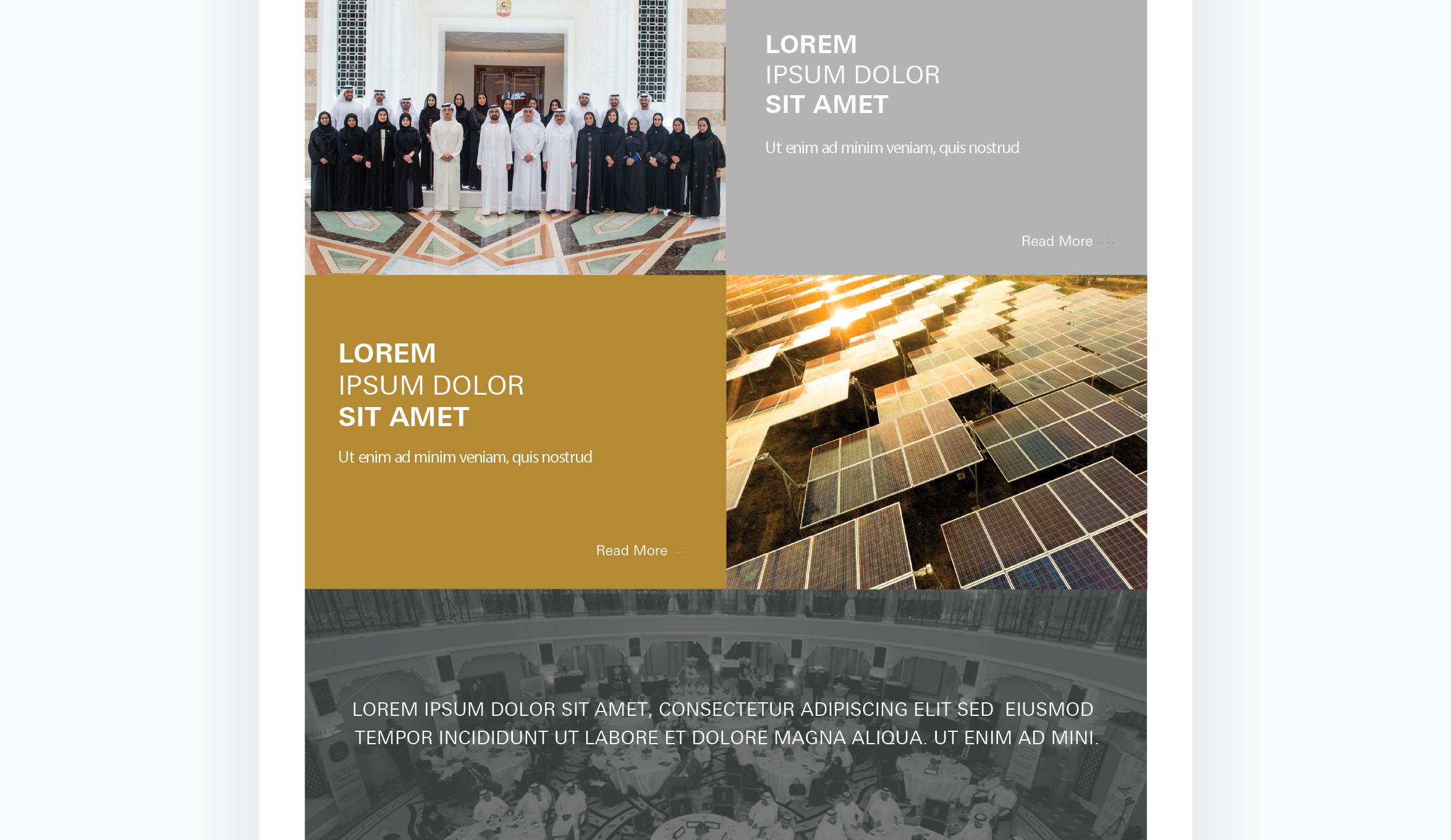
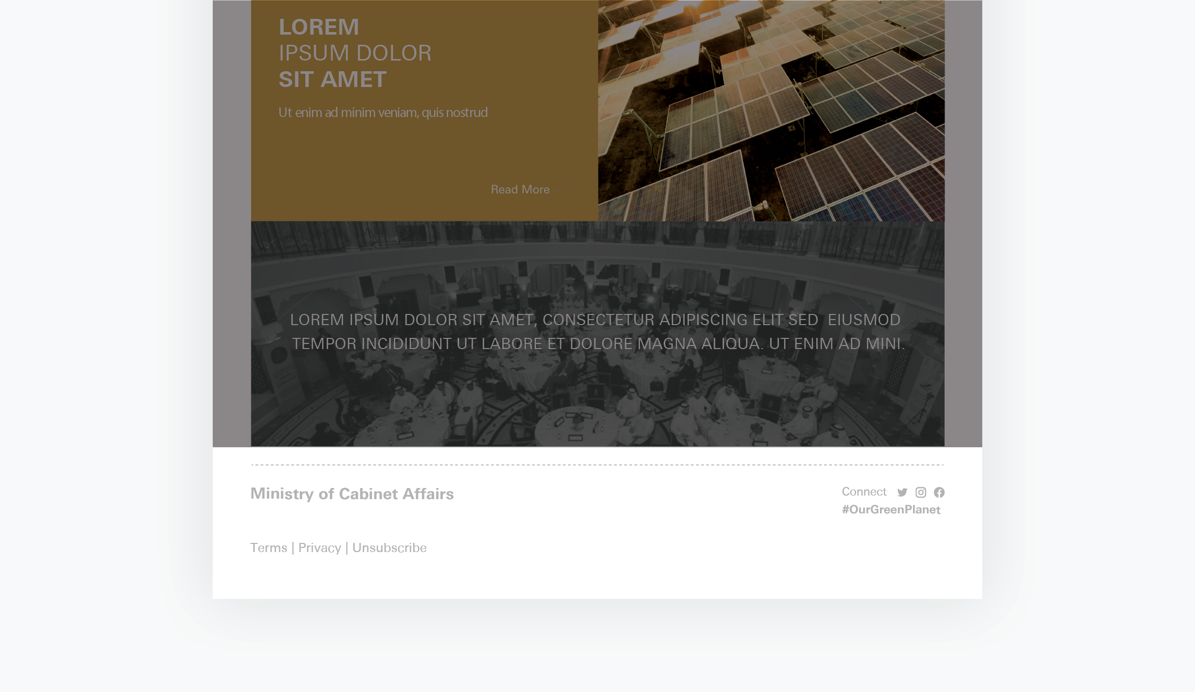
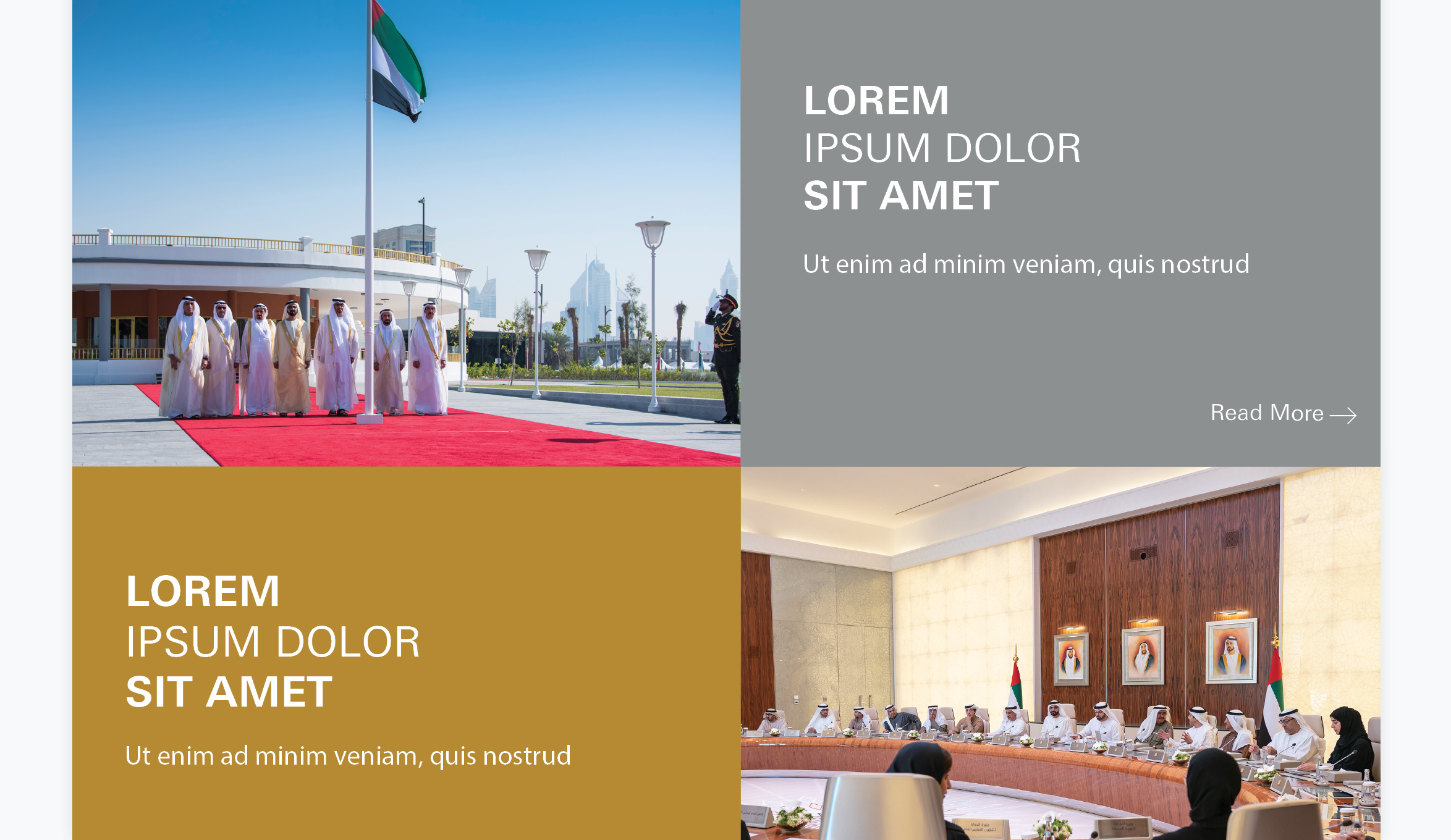
Posts
Always be sure to use appropriate high-quality images for social media posts, in accordance with the photography guidelines.
Best Practices:
Incorrect Practices:
Keep in mind...
Do not include the logo in social media posts. If necessary, use the wordmark instead.
Tip!
Ministries are free to choose the fonts that are most suitable for their posts.
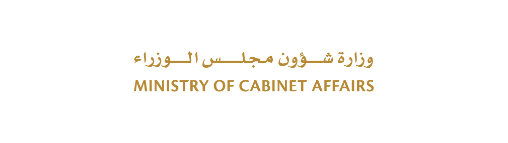
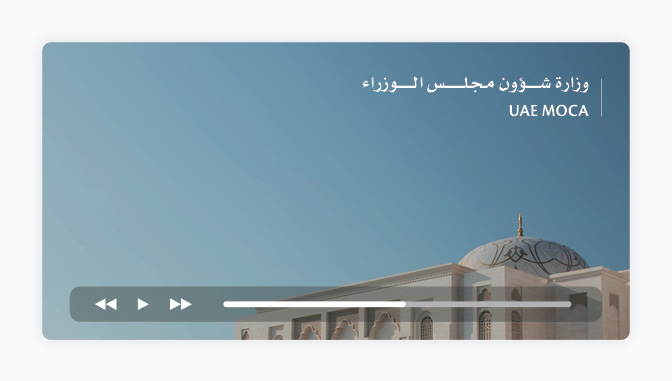
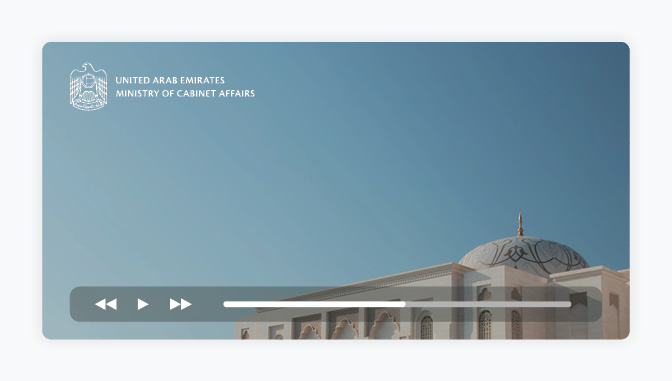
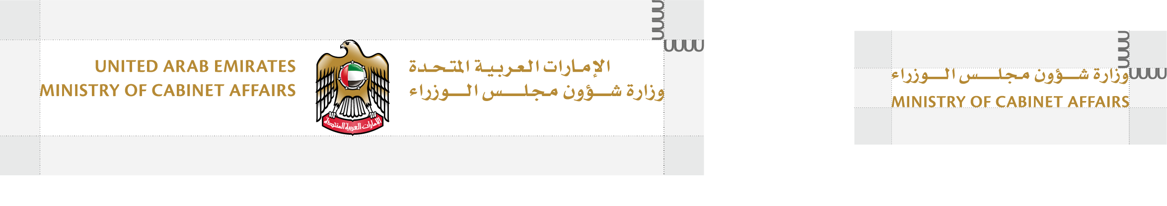
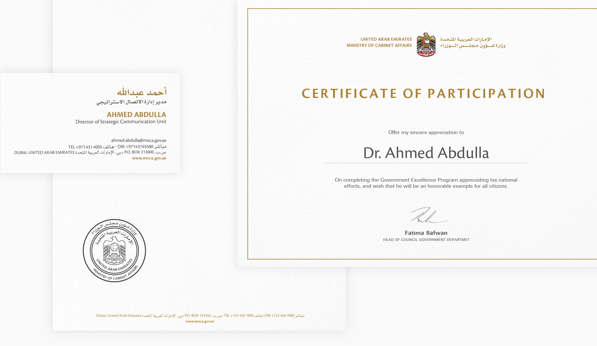
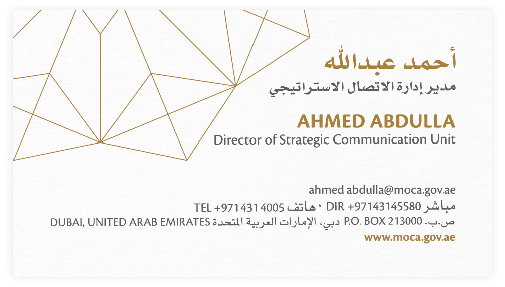
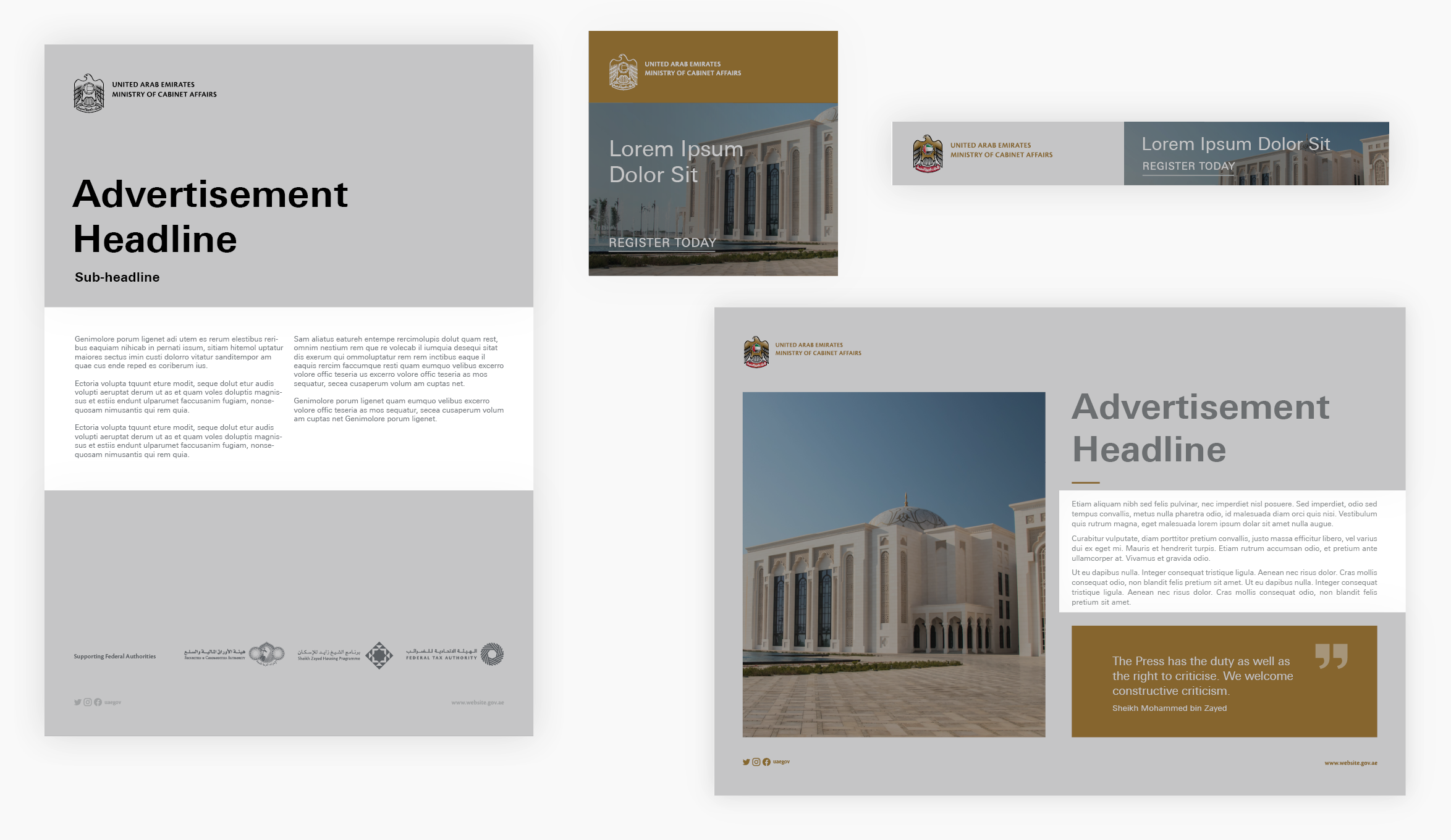
Wordmark
A wordmark is used instead of the logo on social media posts; it should not intrude on the image and must be legible.
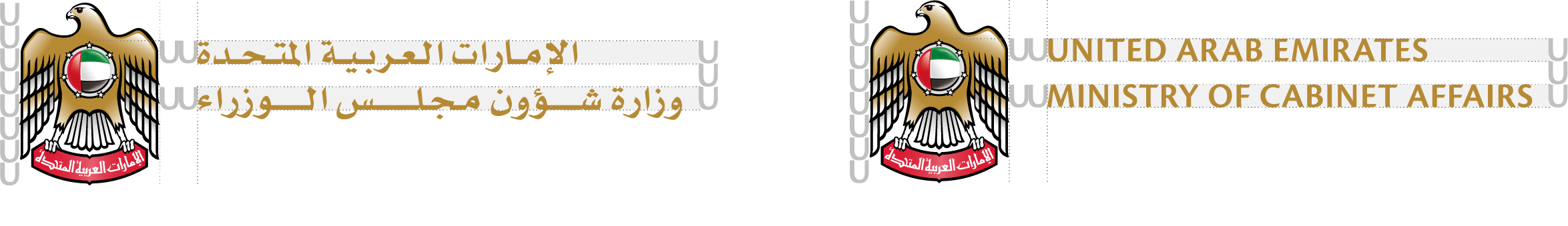
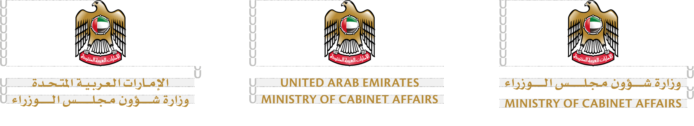
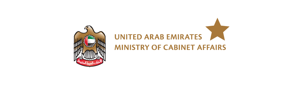
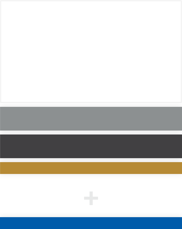
Horizontal Arrangement
The abbreviated ministry name in English is placed to the left of the full ministry name in Arabic (aligned to the bottom), placed in the bottom-centre.
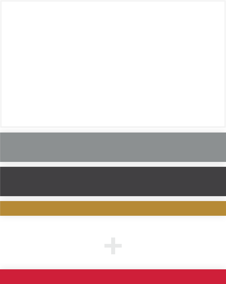
Vertical Arrangement
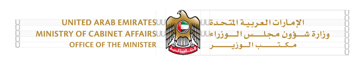
The full ministry name in Arabic is placed above the abbreviated ministry name in English (aligned to the right), placed in the top-right corner.
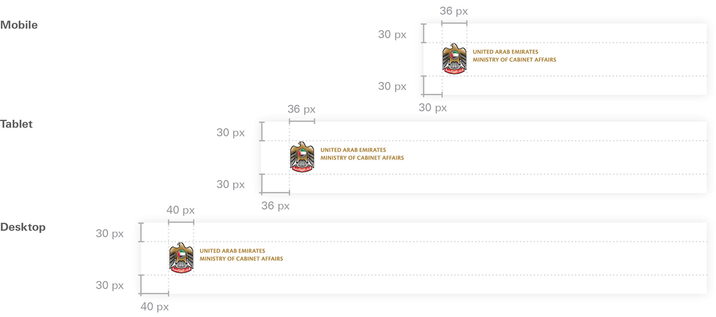
Wordmark Specifications
Mobile App
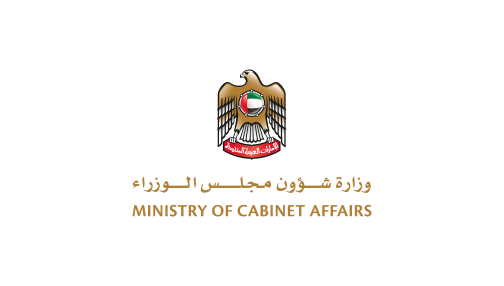
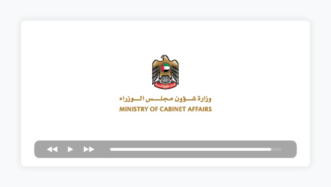
For mobile applications, the full-colour vertical logo may be used inside the app (e.g. splash screen), but not as the app icon.
The vertical logo can be used on app splash screens
Due to App Store restrictions, entities may not use the federal emblem as the app icon and are required to create unique icons instead, related to the service the app offers.